

Not ranting over anything right now but more like developing a drawing I had made a month or so ago about a rant sketch as will be explained below. When I finished sketching it, I left it as it was without coloring it in as I was not yet ready to decide what to do with it and yet wanted to share the drawing and write about it. It was not till a weeks later that I thought what a good idea it would be to give it a shot at coloring! First with watercolor, followed by another version in digital.
The Sketch
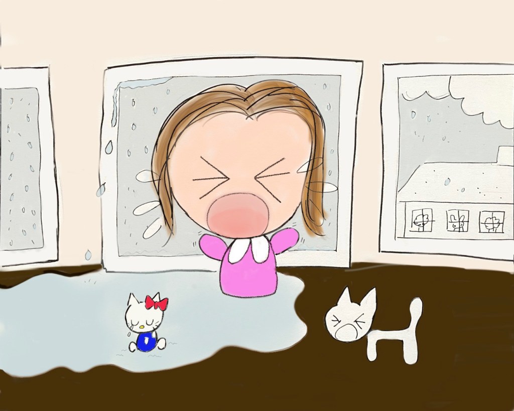
So which sketch was it? On a page from Strathmore’s Visual Journal for Mixed Media, I made my pen sketch as per Weeping over Window. At the time, I made a pen sketch about my distress and panic over a window in our attic leaking water from a heavy rainstorm. My BF had been away at the time which made me feel even more helpless but I of course managed to deal with it in the end. Hence a rant sketch, and here it is:

Import and Color
As it turns out, I did end up coloring in this sketch in with watercolor and related media some weeks ago, if you recall: Weeping over Windows (in Color). The painting turned out rather well, and I figured a digital version would also be a brilliant idea. And why not? Luckily, I have a photograph of the pen sketch saved and was then easily able to import it in the Procreate app and start coloring away! I went for the Air Brush here, and allocated a separate layer for each area or shape. Not quite complete but you see the gist…
Introducing Texture
And here comes the interesting part! Once I got the colors in, it was time to play around with some texture brushes for further enhancement. A variety of them were used, including the Water, Cloud and Hard Rain from the default Elements set of brushes. For the wooden floor I decided to get creative and go for All Over Dry Strokes from one of Jason’s Texture brushes (add-on) and for the wooden window frame, how about the Chemical Trail? And of course the cat gets the Fur Brush treatment! I also experimented with the Opacity and the Blending Modes. A bit of tweaking here and there, and I was good to go!

Go Compare
Now that was a lot of fun! Whilst we have an “analog” watercolor version, we see that creating also a digital one adds another dimension to the same drawing. The watercolor is more subtle and muted, but had I opted for acrylic or markers, the effect would have been different. By contrast, the digital version is more explicit, further enhanced with the textures. Both, I must say, convey different messages: One is clearly trying to calm me down, whilst the other wants to express how I’m really feeling and sympathizes with the distress. And just to compare the two:

Amazing how different versions of the same painting give different impressions! I ought to create more similar analog and digital versions of the same painting and see what happens. In fact, several versions including acrylic, watercolor, markers and digital, etc would be quite an interesting study. That ought to be one of my big upcoming projects to consider! I shall of course start with something simple…
