

Whilst BF’s dad was succumbed to a brain tumor, we wanted to stay in Holland and be near him so didn’t take any holidays all summer. Naturally, it was a difficult time for all with all the uncertainty about dad’s progress. Then late last month, he sadly passed away. A week went by after the funeral, and my BF suggested taking some time off to clear our minds. We really needed to get away from it all as part of grieving. Whilst I had no time to paint at all during our relaxing break, I figured it was better to keep him company and to focus on what both of us enjoy doing together which is photography. Painting can wait till I’m back. Upon returning I can not only resume to where I had left off but also to come home with fresh ideas. I slowly eased myself back to painting once I was home and at the first available opportunity. Initially, I had no direction as to what to paint so just went by intuition and as it turned out, I ended up painting about how refreshed we felt after the break and how much we really needed it.
Autumn Background
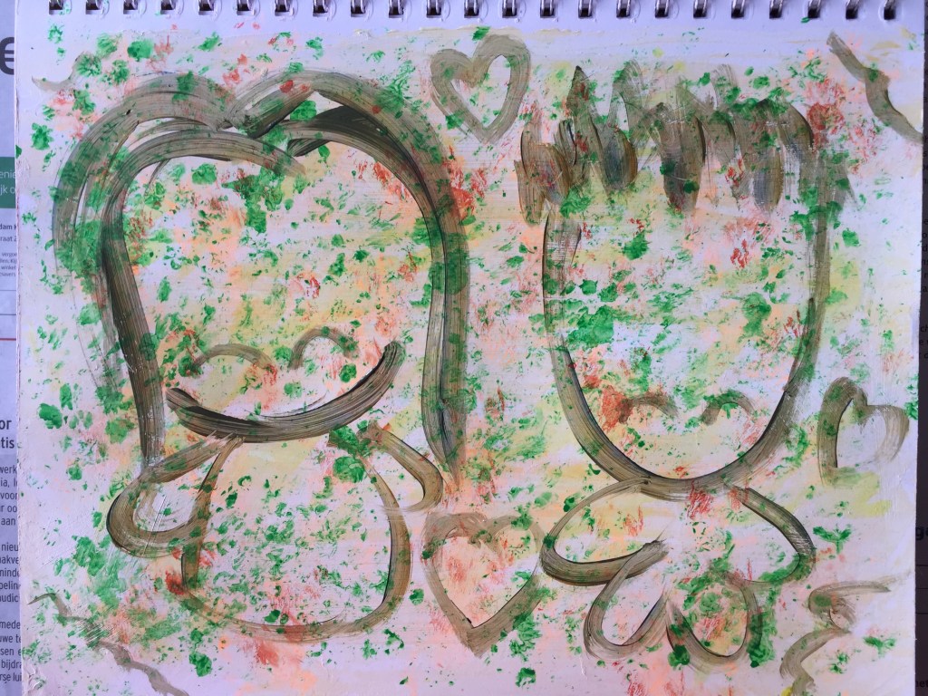
We spent our break in Italy where it was sunny and warmer. Upon returning, we realised how quickly Holland became autumn in the 12 days we were away. I then grabbed a page from Strathmore’s Mixed Media sketchbook (190 gsm) and decided to opt for an autumnal scheme by briskly brushing on some white gesso mixed with some light orange liquid watercolour by Dr Ph Martin’s Hydrus range. Once dry, I randomly spread some green, yellow and orange acrylic inks with my fingers. I didn’t forget to add some fluorescent orange too!


Drawing Us
Something told me to paint me and my BF together. Though we are still sad about dad’s passing, we enjoyed our vacation and each other’s company. Smiling again and looking happier. Mixing some ultramarine blue and yellow ochre paint (Talens Amsterdam Acrylic), I concocted a bit of an olive green/brown shade and began doodling us. I like mixing colours like this to create a colour that is not too strong as black or even brown to soften the harshness of the rough outline. Furthermore, I combined the paint with Matt Medium for a more transparent look.
Colour us Cute
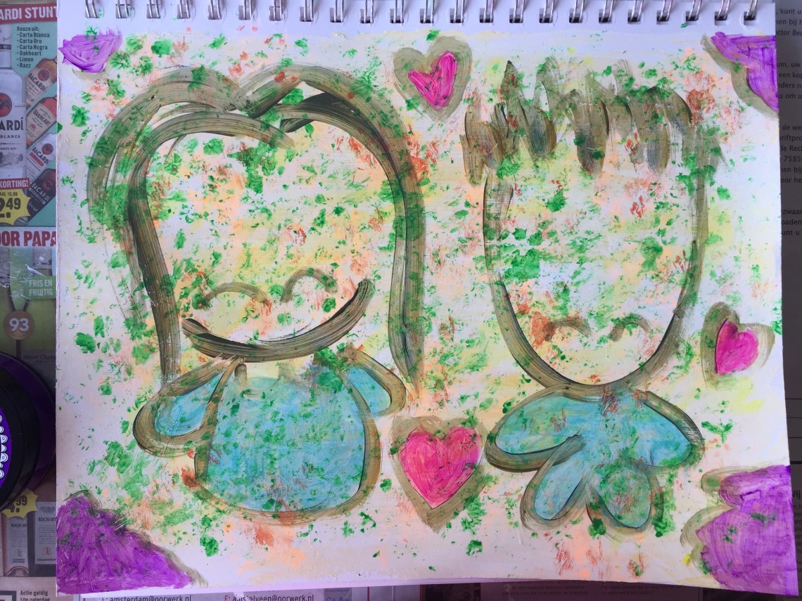
I was in the mood to use bright vivid colours again. Perhaps it is a reflection of letting go. This time, we are wearing matching colours! I used Dylusions paint in Calypso Teal for this. Then for the hearts, I went for the pretty Bubblegum Pink. The purple bits were in Crushed Grape. For all the paints, I also combined with Matt Medium once again for the transparent appearance. Quite a simple painting but I still wanted to “accessorise” it a bit.
Accessorising the Painting
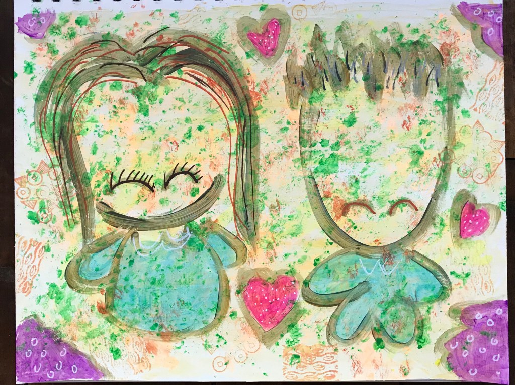
I decided to take the plunge and began rubber-stamping the background with some orange Distress Ink and Oxide. Then with some Molotow acrylic markers, I added some details like the hair streaks and drew over the eyes to enhance them a bit more. Some doodles on the background and outfits were also added with white acrylic marker. And now I think we are good to go!
I wanted to create a happy and lively painting despite the fact that we’ve been grieving. It was a good idea to take some time off and come back with a clearer mind and get away from it all. Life needs to go on, and we need to let go. His dad doesn’t want to see us crying anymore. As he watches over us, his dad wants to see us happy again and enjoy life to the fullest. Just as he had done himself.

1 Comment