

This painting is quite a science lab of conducting various experiments. The experiments involve checking out the various acrylic mediums and seeing their effects on texture which came out really cool! My last two earlier blogs outlines them more in detail.
Another experiment here involved integrating soft pastels with acrylic painting. Of course plenty of artists have already done so but I wanted to see for myself!

Divided my paper in 9 squares and filled in each lightly in pencil with various flowers and one humble leaf. Realising the number 9 is unlucky in my native Japan, I drew two flowers in one of the squares to make it ten items lol. At least I won’t have to live with that superstitious conscience!

I outlined the above left flower and bottom right leaf with soft pastels in in cobalt blue and green, respectively. And then washed the entire paper with a mixture of gold liquid paint with acrylic gel to provide some sheen.
The important part of this part though was to see the interesting result when the dusty soft pastel colours are painted over. I quite liked that smudgy effect of the pastel colour being smeared by the paint and regretted I hadn’t coloured in the areas with pastels more to really get the effect more visible. Oh well I shall try that again in another painting soon…
 So I instead continued on and only partially filled in the flower with the same pastel. I was curious what would happen if I took a small brush and dipped it in acrylic paint slightly diluted with water. Wow it certainly gave an opaque version of watercolour but with colours being more intense. I followed the same technique with the other flowers in the painting in their respective colours.
 After the paints dried I felt I wanted more so this is where the acrylic mediums and modelling paste came in! For the stamens and leaf veins I used some modelling paste to add some texture, as you see with the purple flower above and in the below photo.
 I also experimented with some other acrylic gels for a matte or a very glossy look. Once I was done with the paints I then went over the flowers with another layer of soft pastels to further enhance the colours and add some dimension to them.
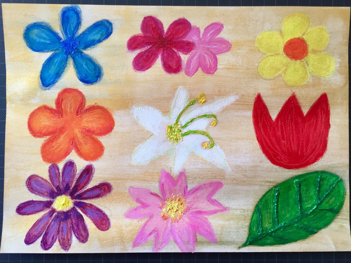 I must say the experiment was quite successful, and I was able to produce a vividly colourful painting of flowers. Apart from not being able to enhance the smeared pastel colours in the beginning, I also felt that the flowers in the middle column could have been better spread out since the pink sakura cherry blossom looks a bit squashed in. Still I am nevertheless pleased with it all and love the various textures and the strong colours created.