

Another Hello Kitty painting! And another fun class with Tracy Verdugo’s Abstract Mojo! This next lesson was called “Playing with Apps” in which we create taking into account strong vibrant color, simplified shapes and high contrast between darks and lights by firstly finding a photo in our phone and manipulating it in a photo app and painting it. But I decided to do it differently. Instead of my usual high contrasts and vibrant colors, I opted for harmonious colors and subtle tones. Let’s see what we can come up with!
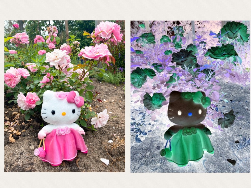
Creating a Negative
And why did I choose to be different? It was purely by chance. To be honest, I was unable to find any suitable “vivid colored” photograph for this purpose for class and was reluctant at the time to download another app on my phone. I did however love the Hello Kitty photo I took the other day of her standing in our garden surrounded by roses and would have loved to paint about it. Whilst the existing photo apps I have had limited options for anything inspiring, I discovered that the Line photo app enabled me to make a “negative” version of photos! Roses became green, and Hello Kitty goes black. How cool would that be to paint…
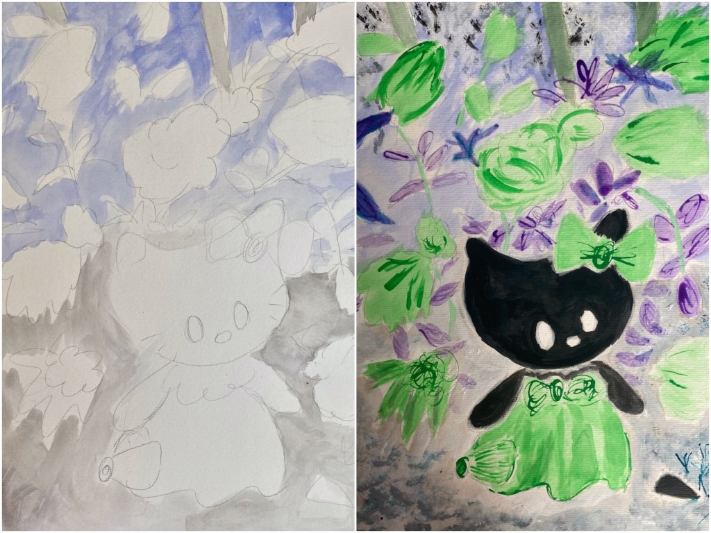
Pencil Sketch
At this point, I was up for a challenge. It’s really not my kind of color scheme I would choose, although I do love the emerald green and cobalt violet. And black is not something I choose as a dominant color for a character. I have very little confidence with it as I feel it’s too overwhelming. Can I manage it? On a piece of A3-sized Canson’s Watercolor Paper, I began sketching with a pencil. It’s not an exact replica of the photograph in every detail and just a rough idea. Personally, I don’t like “copying” from an existing photograph and prefer to it as an inspiration or idea then create my own interpretation of it.

Painting Away
Once I was happy with the sketch, I began painting with acrylic inks. Harmonious shades seemed to be the theme here along with a variety of tints and tones. Hence, a selection of inks included purples, violets, blue and green along with white, grey and black. I first began with the background as a basis working my way through the flowers and Hello Kitty of course. Wow, I do love the black!
Finalizing
Fine details had to be added as well as some visual “texture” using the tip of the ink droppers and a white gel pen. Looking at the whole picture, the color scheme for one thing is not what I would have normally gone for, seeing my favorite palettes fall in pinks as a basis then opting for contrasting colors rather than, as in this case, harmonious ones. Furthermore, black tends to be underused in my paintings and seeing how stunning Kitty turned out, I should use it more often. In the end, I managed, and here we have it!

This was quite a challenging but enjoyable session. Always fun to create out of the ordinary, and this lesson definitely proved it. Rather than contrasts, I chose harmonious colors to work with in blues, greens and violets. Another is discovering how black, a color I had less confident using, can be stunning as main focus. Great way to break away from my comfort zone! Now I’m so glad I decided to do something different from what the lesson entailed, but I shall definitely like to repeat this lesson in future and follow it as instructed! Meanwhile, what do you think of my Hello Kitty now?
