

Another vibrant flower theme! Can’t help it, seeing how beautifully our garden is becoming with more green and flowers blooming. It’s only June now, but wait till it gets even better during the summer! And here is a fun abstract painting I created a few weeks ago taking advantage of my paint palette and turning it into some negative space art!
Recycling My Palette
Most artists like myself like to mix colors or apply the paint on separate paper before the brush touches our canvas or paper we are painting on. It’s the alternative artist’s palette! Another advantage about this is being able to test colors beforehand. And let’s not forget that excess paint can be wiped off the brushes or drawn with on this. Once this palette is used over and over again, you would be amazed to see how it all looks over time: an interesting mixture of acrylic paint and ink, India Ink, gouache and markers in a variety of colors. I love this chaos! And why waste this piece of paper? Why not recreate!

Flower Power
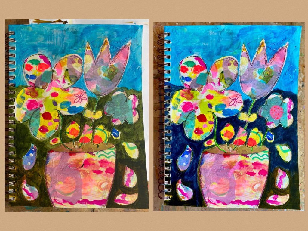
So how to recreate with this one? With all the bright vivid shades abound, the first thing that came to mind was flowers! A few collages of wrapping tissues were firstly glued on areas I didn’t care much for or felt needed more filling in. Then I was ready to design my recreation! A pot of flowers in various shapes and sizes seemed like a great choice. Once satisfied, I outlined my sketch using a black charcoal pencil so I can easily erase areas I didn’t like. Then that was traced over with black marking pencil. That’s right, the piece is to be a negative space painting and hence the background was painted white to get an idea of what the subject would all look like. So far, so good!

Painting Away
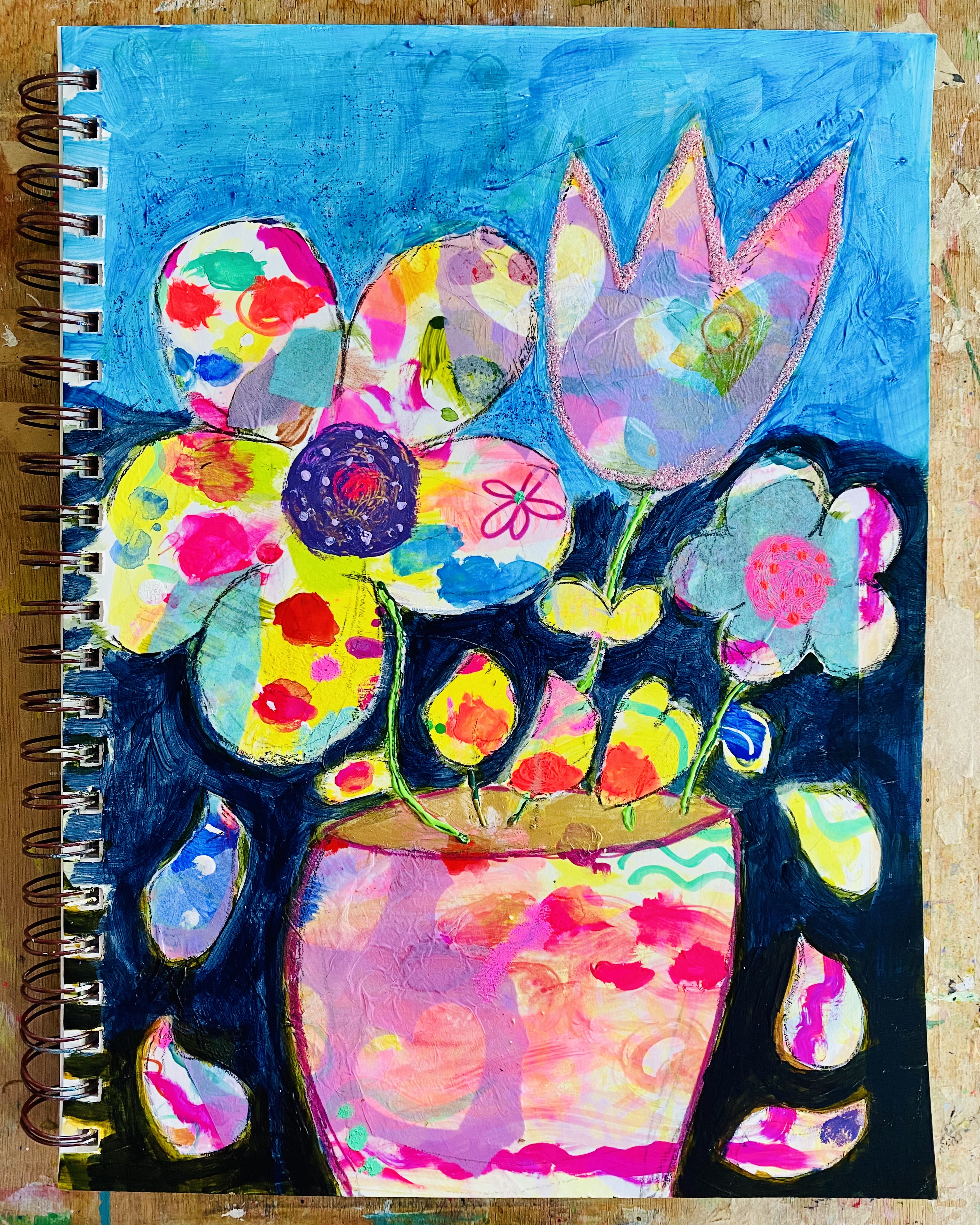
As you can see, some changes were made to the background. Although the sky remained a Manganese Blue Hue (Golden Fluid Acrylic), the ground was switched from a Green Gold to Payne’s Grey. I think the latter lets the colors of the subject pop out more, don’t you think? For the stems, Sennelier’s Light Green 3D Liner (acrylic paint) was a great idea to introduce some texture to the painting. The soil in the pot was colored in gold rather than earthy brown to sneak in a little bling too. At this point, I was ready to give the flowers a bit more character and hence tried out some of Holbein’s Acryla Gouache in the centers as seen in the smaller flower on the right hand side. All looking good now!
Finishing it Off
And now for some finishing touches, mainly adding texture. With a selection of colors from Acryla Gouache, I painted in the center of the larger flower. The thick consistency of the gouache provides some wonderful textures to the painting. The stems of the flowers were further enhanced with some dark green Amsterdam’s Relief Paint in combination with the earlier-used 3D Liner. Another of my favorite texture in my paintings is glitter! With the tulip needing a bit of uplifting, I outlined it with some light pink glitter glue (Ranger’s Stickles). The pot was also outlined with some glitter pen in dark pink. Then around the sky, I applied some blue glitter gel (Stickles). And now!
And what a fun session that was! It’s been some time creating a strictly negative space painting like this, especially flowers. What made it also fulfilling was being able to recycle unused or excess paint smudged on paper as a palette. Waste not want not! In fact, this ought to be an on-going method of getting creative as I continue to use up my paint palettes to recreate. This would be great to do on canvas too! Can’t wait to try that out and see what other amazing stuff I can come up with.
