

Just completed the last lesson of Unit 2 of Tracy Verdugo’s “Abstract Mojo” the other day. This Lesson is called Good Jaguar, Bad Jaguar in that we create something abstract with something familiar from our personal surroundings. Whilst Tracy chose a hand carved Guatemalan jaguar, I went for a kitty inspired by my collection at home of Hello Kitty! The lesson calls for finding something at home to use as inspiration for this exercise or alternatively, a favourite character from a children’s book. So Hello Kitty it is! For the purpose of enhancing the shape of the animal, though, I skipped her ribbon.
The Start
The process of this exercise involves “working fast and loose, trying different mediums, overlapping images and watching for a sense of character to emerge” as quoted by Tracy herself. She also adds: “We are going to tap into our inner three year old and paint fast, loose, intuitively and expressively!” And hence a variety of mediums came to mind including charcoal, acrylic ink, gel pen, markers and oil pastels on a large piece of A3 watercolor paper by Cansons. I started with a stick of black charcoal, then some primary magenta acrylic ink using the tip of the dropper and spreading with a wet brush. As you notice, some of the black from the charcoal merged with the ink. More overlapping effect was created by doodling another Kitty with some white oil pastel and then painting another Kitty on top of it in Payne’s Grey so the oil pastel, which resists water, shows through. So far so cool!!

More Kitty’s
And I kept going on, taking various mediums sketching my little Kitty’s. After the Payne’s Grey ink I went for gold gel pen as per Tracy’s suggestion and adding details in with some black pen. Then another face in Teal fluid acrylic by Golden, once again filling details with the gold and black pens. And finally, another Kitty in charcoal this time using the willow version as opposed to the stick. Here the black comes out stronger because willowed charcoals are softer. Details and the dots were then done with some violet ink. Then with the magenta, teal and violet, I painted color blocks in the background. At this point, though, I did get in a rut not knowing what I should do with the rest of the spaces. What color for instance should I go for next?

Completion
Given the colors so far were primarily cool toned, I went for some orange and gold. The Payne’s grey used for one of the Kitty’s was then painted on the lower left corner to balance the painting more. I brushed some gold ink to a bit in the center and filled that in for the Kitty in gold gel pen to enhance the gold more. Finally, Titan green, a rather matte green-white color, was chosen in some areas to play down the vividness of the existing colors. Some of that was also dotted on in the corner for added cuteness. White spaces were deliberately left as is to demonstrate overlapping of the Kitty’s. And now, here we are!
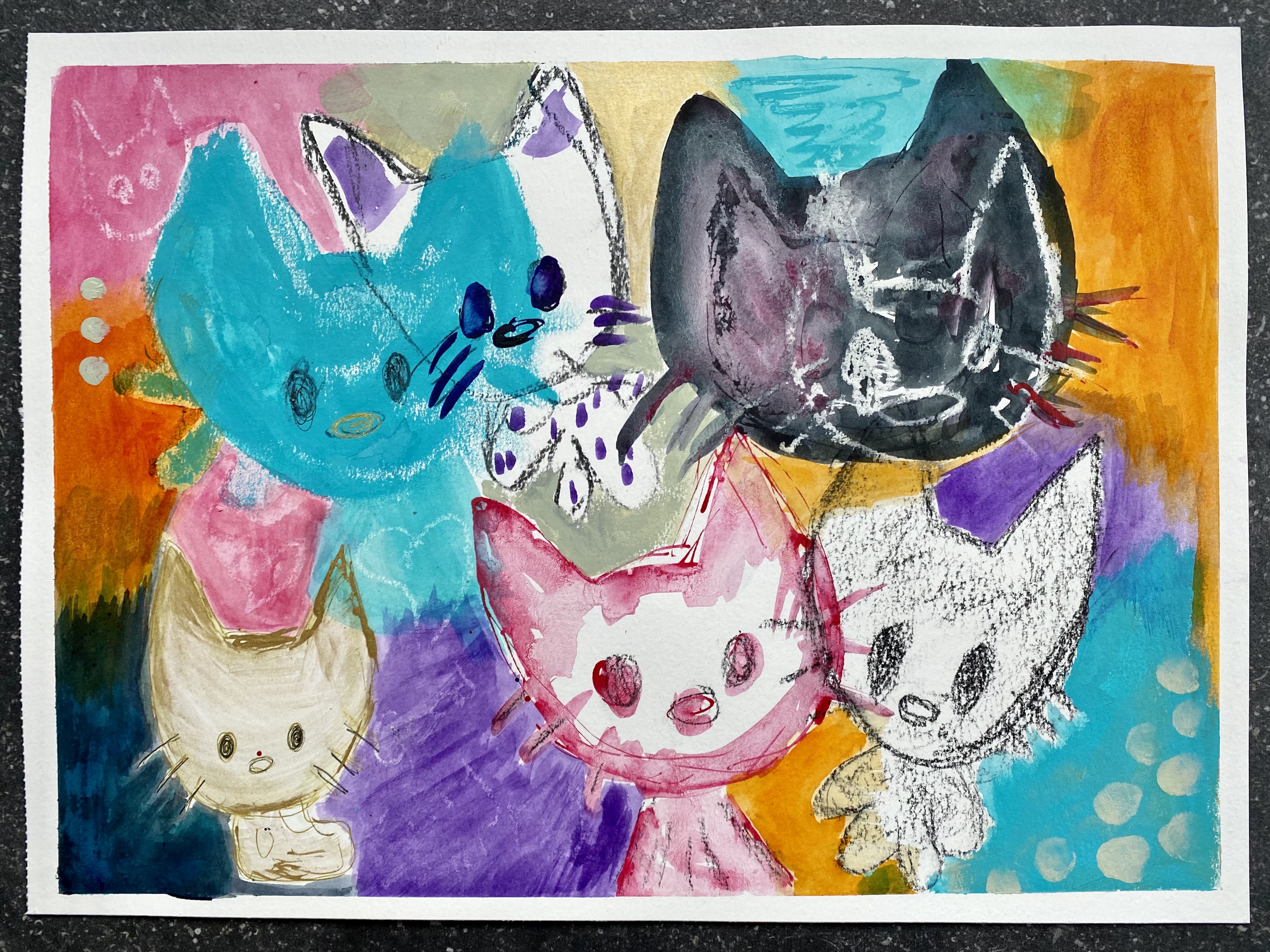
This was definitely a wonderful experiment. I never thought I could create something even as cute as an anime kitty into an abstract painting! According to Tracy, we can repeat this exercise again with different objects in order to practice painting “fast, loose, intuitively and expressively”. I would most definitely like to try this with painting Little One for instance and expanding my mediums and color choices. So far, though, I do love the result of this painting. Combining kawaii with abstract is so much fun!
