

Living in the countryside in the Netherlands, we come across all sorts of flora and fauna especially as we live next to a farm. Lots of cows about, some horses, tons of birds and of course cats. Another that needs to be mentioned are lambs and sheep! Haven’t seen much in my turf but when I was out jogging the other day, I was pleasantly surprised to come across a few along the field! I of course had to paint about it, and further it was an opportunity for me to try out my new set of watercolor tubes by Hobein.
Pastel-toned Watercolor
Apart from neon colors, my other fixation I recently developed is pastel tones. You may have noticed in the past blogs about my recent purchase of 50 pastel-toned Holbein colored pencils which I’m pleased about. This time, I thought I’d have a go with watercolor, also by the same brand, purchased on-line. Shall we see how it worked out?

Pencil Sketch
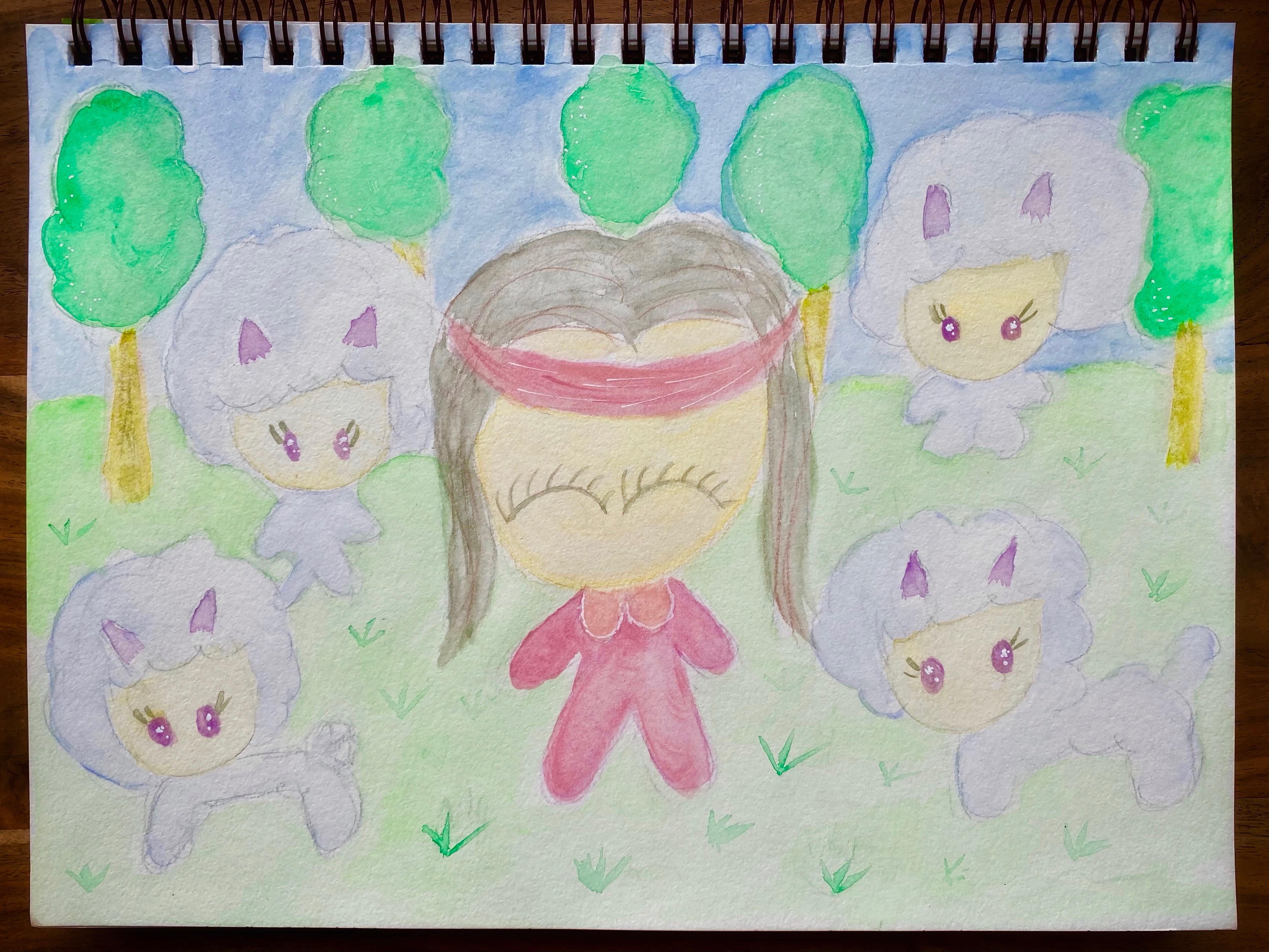
I always start with a pencil sketch when doing watercolor painting. Strathmore’s Visual Journal for Watercolor was used for this. Rather than graphite pencil, though, I experimented with aquarelle pencils (Caran d’Ache’s Prismalo) and lightly drew away. Me, in the form of Little One, posing in the middle of the field in jogging gear surrounded by four cute sheep. In reality, though, I just continued jogging and the sheep were not even close to me but just meandering in the field afar. Just thought I’d be a bit more imaginative in the painting!

Let’s Start Painting!
Normally, I start with coloring the background first. The only problem with this, though, is that when one firstly outlines in aquarelle pencil, the color tends to run when water is applied which would mean the sky would turn green! First then I started with the grass, then the trees then the face. This was further followed by the tracksuit. At this point, I was a bit disappointed with how this so-called “pastel” shades turned out. I was somewhat expecting a more chalky “mixed with white” appearance, and the result was anything but! The pink, for instance, looks rather red. Let’s see how the painting nevertheless progresses.

Counting Sheep
As I imagined, the painting does not get any more pastel-toned. Perhaps the sheep, which I colored a lavender shade, turned out marginally pastel. To get the brown on the hair and yellow ochre effect on the trees, I merely mixed the available colors in the set. This piece was finished up with some white gel pen. Despite its shortcomings with the watercolor, I must say the painting itself turned out cute and that’s what counts.
A bit of a disappointment with the watercolor set, although the quality of paint is top. It was more that the colors are not pastel-like as expected which was a pity. On the brighter side, though, the colors do indeed come out strongly and vividly, giving an alternative look to what had been anticipated. Perhaps in future, I could always blend the color with some white and see if that would help bring about the more chalky pastel-toned appearance. The painting of Little One and the sheep nevertheless remain kawaii!
