

Hello again, I’m back! That same lame excuse: I’ve been so busy. The past few weeks we’ve been tidying up and reorganizing our home after some extensive renovations. Now that the COVID rules have somewhat eased and many our age have gotten fully vaccinated, we are now able to invite friends and family over to our house. Last weekend we had my boyfriend’s high school buddies over with their girlfriends, and this weekend his grown-up boys came over for a barbeque. This of course means having to clear up the mess around the house and unpack the remaining moving boxes that had been sitting in limbo waiting to be opened up and tidied away. With just a few unnoticeable details to work on, we can say we are complete and now I can sit back and relax a bit and work on my art and writing!
Starting a New Class!
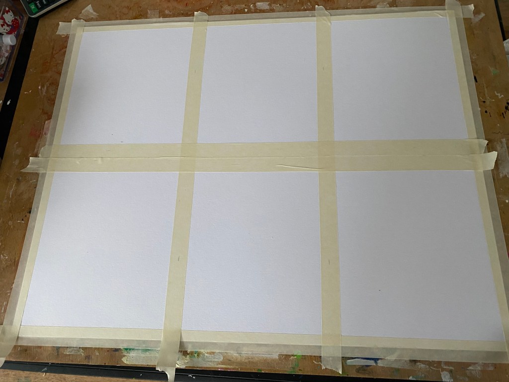
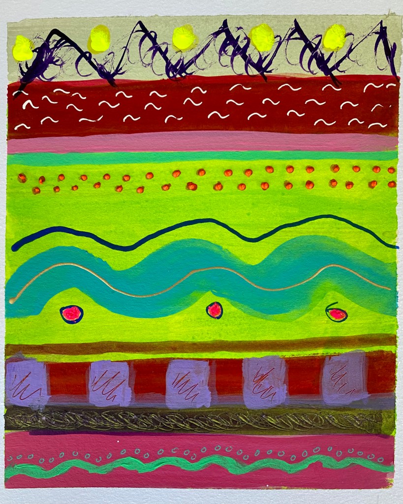
I’d now like to share with you a little painting I made a few months ago before things got busy. A bit different from my usual work as it’s actually a practice session turned into artwork. Once again, I’ve been following Tracy Verdugo’s on-line classes and just started a new one. This is the first lesson of Tracy Verdugo’s Paint Mojo classes called “Line and Color” in which we focus on the color palette and discover the many variations of creating lines. First, we grab a large piece of Mixed Media paper and divide it into 6-8 sections using masking tape. I have to admit this was the most difficult part. Getting the sections all equal. Then trying to create perfect squares for each which was close to impossible. I gave up and rather than get stressed about it, I continued and decided to be content with 6 rectangles! The objective of this lesson is to practice with colors and lines and not get it all geometrically perfect isn’t it?
The Colorwheel
As we established, the further underlying aim of this class is to get out of our comfort zone as is usually the case. We usually get so accustomed to using the same old color combinations that we like and then get stuck in a rut. Perhaps it would be an idea to experiment with what other combinations work too? I used my color wheel throughout the exercise to get a better idea of harmonious and complementary, tones, tints and shades etc. Of course I knew most of it already but it’s always good refresh your memory! Tracy suggested that each time we use a color that we note it down which may be handy for future reference. I guess it’s always a good idea to to do that for any painting we do. Must remember to do that each time!

Dipping the Paintbrush In
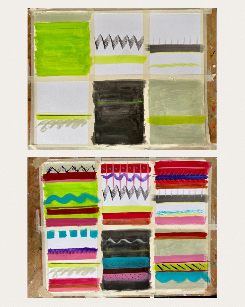
As you can see from the above photo, a wide range of mediums was also used including acrylic paint, acrylic ink, and even India Ink. We first start out with black. One of the sections would be fully colored in black to create the black background we can work on. Next was to use some greyish shade like Titan Green Pale (Golden Acrylic Fluid) for the same reason except in grey. That way, we see which colors work well on backgrounds other than plain white. And after that, here comes the interesting part: finding ways to create lines in other sections. Thick, thin, horizontal, vertical, diagonal, geometrical, dotted zig zag and even curves! We tend to think of lines as being horizontally or vertically straight, but who says this should be the case? This exercise helps us think outside the box. Come think of it, a line is defined as being potentially infinitive if we continue drawing one, and hence, whatever shape or form, I have created some work using lines!
Making it Even Prettier
I had so much fun trying out different colors next or on top of each other to see what it would look like! Some worked together, others didn’t. Another is being able to come up with different permutations of lines and seeing which looked good with each other. In order to keep the creative mind flowing, Tracy gets us to think in terms of contrasts. Thus, thick and thin, straight and curly, straight and diagonal, linear and circular, small and big and so forth. The same train of thoughts also apply to color: complementary (opposites of color wheel), split complimentary, analogous (tone, tint, shade), light and dark, bright and dull, etc. I kept going on and on till I was ready. Then to top it all off, I decided to take a step further and add some patterns in the lines with gel pens, give some texture with Sennelier’s 3D Liners and create some bling with glitter glue. Et voilà!

What fun this session was! It’s always great to explore beyond your comfort zone again and discover. Here I was able to play around with different color combinations. I’m no longer afraid to use earthy shades for instance, as I can create something stunning with bright vivid colors. Another is that I was able to discover the various forms of “lines” which are not necessarily confined to being straight or solid. Furthermore, with this exercise I now created something interesting as well as beautiful, a bit resembling some textiles from Mexico. Now I’m really craving for some holidays!
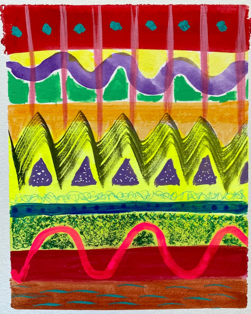
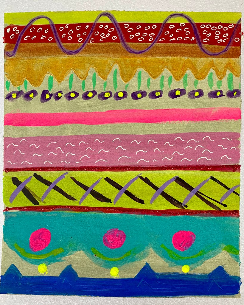
Below is a little gallery of each of the individual sections. I won’t be cutting them up for now and thus just took photos of them separately. Please feel free to browse!


For more about Tracy Verdugo and her amazing classes please click here.
