

Here is the second of my three-part Rainbow Project! This was inspired by a BBC article I read about some school kids making paintings of rainbows and posting them up on their windows during schools being shut down. Great way to cheer up during this COVID-19 crisis! My first one was Reverse Rainbow, an accidental painting that lead me to create a trilogy for this Rainbow Project.
Pencil Sketch
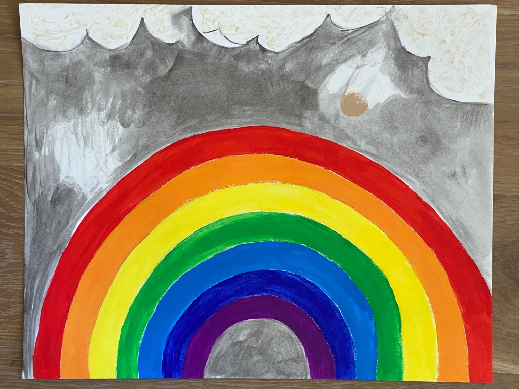
For this painting I also used a large 40 x 50 cm paper of 360 gsm which is great for mixed media. The rainbow is in the center this time, and I also wanted to add some kawaii characters like Little One and her friends. Apologies for the bad photo but as below.

Painting Away
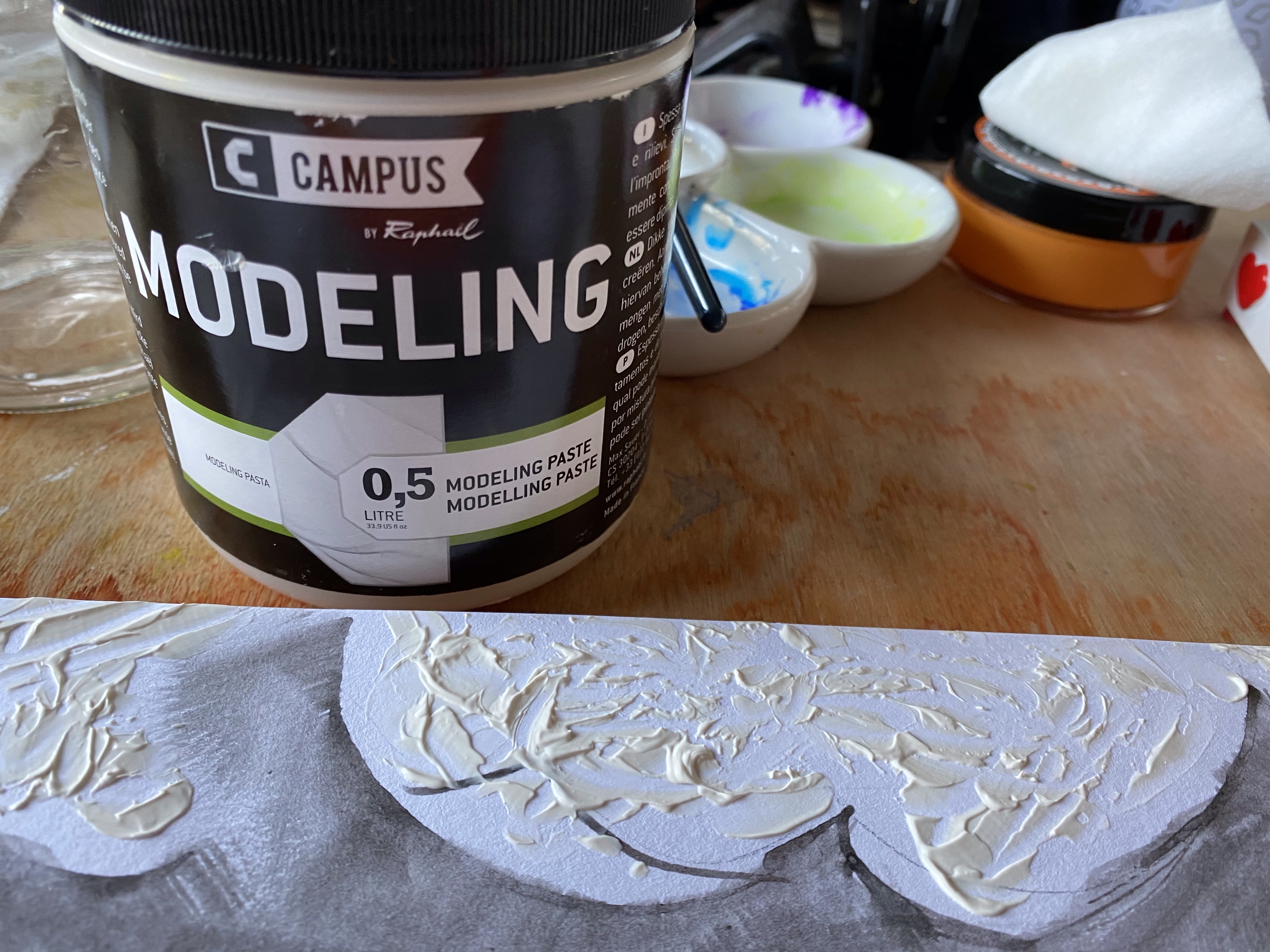
I firstly painted the background, the grey sky with some clouds. Drops of grey acrylic ink were applied directly on the area and swirled around with a wet brush dipped in water. Once dry, I spread some modelling paste on where the clouds would be, and whilst waiting for that to harden, I began colouring my rainbow. I made sure I got the colour order correct this time! This second painting is to represent the proper rainbow.

I can’t remember the last time I used my pots of Dylusions paints. And why haven’t I done so all this time? I guess I’ve been focusing on alternative mediums like inks and got so accustomed to them I neglected the paints. Now would be a good time to return to them! I love their range of brilliant colours, and the consistency is perfect for painting objects. To spread the colours evenly and to economize I blended the paints with acrylic medium also to achieve a glossy finish. Here are the shades I used in the order of the rainbow:
- Postbox Red
- Squeezed Orange
- Lemon Zest
- Cut Grass
- London Blue
- After Midnight
- Crushed Grape
Making it all Cute
Now the fun part: Incorporating the kawaii Little One and her friends! I used a variety of mediums including India Ink (Dr. Ph Martin’s Bombay Ink) in Sepia and Yellow Ochre mainly for the cute animals and Little One’s hair and eyes. For the faces I got a bit lazy and resorted to Jane Davenport’s portrait paint. Full Body Acrylic in light magenta was used for the outfits with the white details drawn in with gel pen. Finally I painted in the clouds in ARA’s Metallic White. And here we are…

I’m very pleased with how vividly the rainbow turned out, beautifully enhanced by the grey background. The cute characters could have stood out more had I not made the grey too dark though. That said, I didn’t want to distract them from the rainbow so I think it’s best to leave them as they are. The kawaii smiles of the Little Ones also more than make up for the drabness of the grey sky anyhow! Looking at this piece, I have indeed forgotten how pretty the colours of the Dylusions paints are. They ought to be used more in future, especially when painting illustrations! We need a bit of cheering up, don’t we?

2 Comments