

After the Teddy Bear Trilogy, am taking a bit of a break from mixed media and acrylic paint and focusing on single mediums. Yesterday was starting on Nihonga Japanese watercolour, and today is with conventional watercolour. Wanting to improve technique and gain some “trade secrets” I decided to follow the practice sessions from a book by Danielle Donaldson called The Art of Creative Watercolor. I chose her because I like her work in which she focuses on still life and natural objects like flowers and animals and makes them animated and cute, very compatible with my style!

In this session, we paint butterflies which is something new to me. Always nice to do something different! First we create a “white space” on the paper and in it we design our painting in pencil first. Here we draw different objects to practice painting on. Apart from butterflies I added some leaves and buds to fill in the empty spaces where it would be too small to add a butterfly.

Then paint away! I used a palette of Koi Watercolor Set by Sakura. Once done and dried, I pencilled in some details and patterns on the butterflies and leaves then glazed over some more colour on top and added some shadows using the brown created from the remaining paint in my palette. Then let that dry before adding more details with some white ink. Here I used Uni Posco felt tip markers in white. For the antenna “wires” I merely traced that with a grey felt tip watercolour pen.

Although Danielle doesn’t mention in her chapter what to do with the rest of the space on the paper, I was happy to take the initiative and create a frame around the painting to give it some completion. Mixed tubes of light and dark watercolour paints and brushed a wash on the edges. Whilst wet, I sprinkled on some sea salt and let it all dry completely. Now look at the patterns that we created!
 I then tidied up the painting by re-outlining the butterfly and plants shapes and here it is:
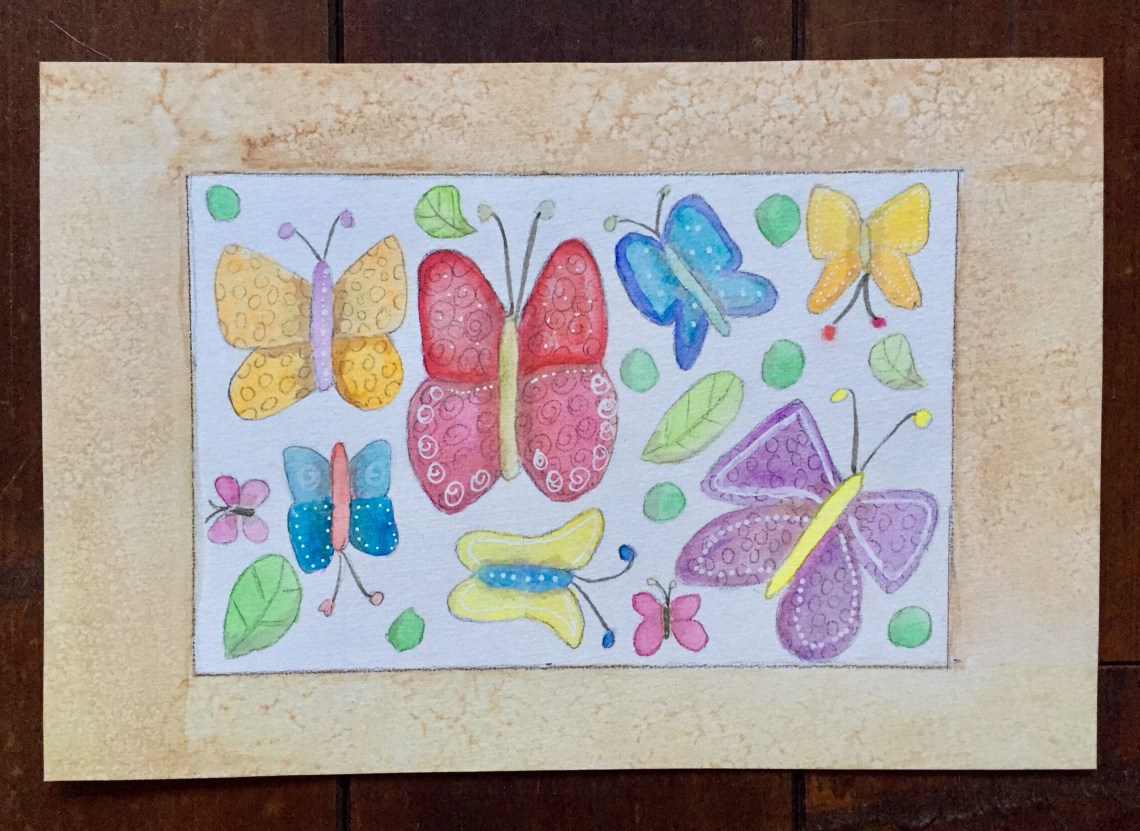 I’m content with the results but wished I was more thoughtful about choosing the colours. Here it looks a bit fragmented and lacks flow. And what do I focus on? Whilst the center area looks fine with strong vivid colours, cooler receding colours on the sides would have been ideal to emphasise the focal point. That said, I was able to practise how to apply watercolour paint in small areas more properly and picked up some tips about adding details. So no need to be hard on myself!

Butterflies, look very Professional, keep up the cool ART work. Have an Excellent Day…
LikeLike
Thank you! Nice to hear praise from a gifted artist like you. Keep up the awesome work and have a wonderful day yourself too!!
LikeLiked by 1 person
Beautiful! I love butterflies. ❤
LikeLiked by 1 person