
Still enjoying my long nature walks in our neighborhood! Seeing how much it is helping with my health issues, it gives me more the reason to get out and appreciate the beautiful Dutch countryside. The autumn scenery is so lovely out here. And during one of my walks along the brook, I came across quite a cute and rather comical situation! A pair of swans on the grass suddenly began trumpeting loudly for some reason, whilst a trio of ducks (Waterhoen actually as they are called in Dutch which is literally moorhen but for this purpose I will call them ducks lol) happened to drift peacefully along the water like nothing happened. Then who approaches in the middle of it all? A farmer’s sweet little tuxedo cat! Just pit-patting about from the bridge and curiously making her way down to the area. But the cat was unexpectedly harmless and just let the birds go about their day minding her own business. How sweet is that! I love that some birds and cats could co-exist like that for once. So amazed and in awe I was that I couldn’t wait paint about when I got home!
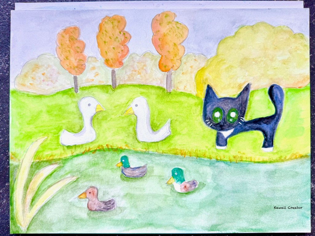
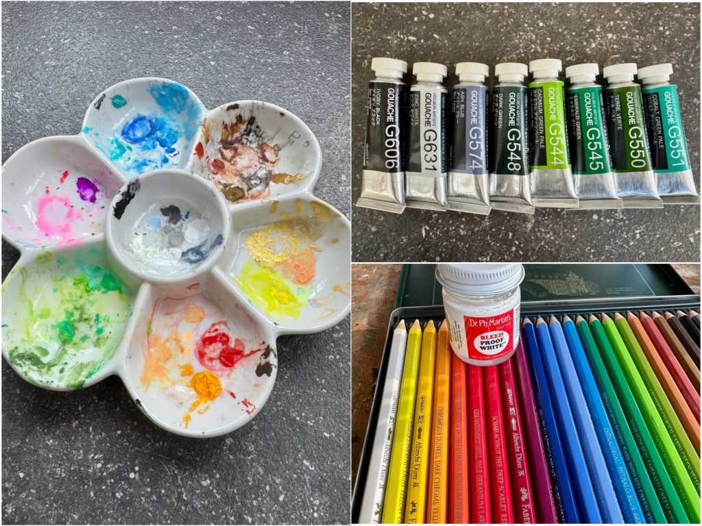
For this painting, I went for gouache on a 9″x12″ sheet of Strathmore 400 Watercolor Block (Cold Pressed 300gsm). The intense and vivid effect of this medium makes it a perfect choice for colorful landscapes and the finer details for the cat and the ducks. Holbein’s brand was used for this, firstly by using up the leftovers sitting in my mixing dish from a previoius painting and combining it with a variety of green shades. As you can see, I had quite a lot of oranges and yellows remaining from the last time. Fine details were then added with Faber Castel’s aquarelle pencils and Dr. Ph Martin’s Bleed Proof White Ink, the latter tried out for the first time and amazed. Depending on if it’s the effect being sought for, this ink certainly pops out much more than white paint pens I’ve been using!
Very pleased how the painting turned out! I do admit though it was a bit off my comfort zone. Firstly, it is not too often that I get to paint landscapes and make it all autumnal. Choosing the correct warm color combinations with orange and green though was what I had initially decided to focus on, and it turned out rather well! Secondly, introducing birds was a challenge especially making sure that they would be two different species. Diligently sketching everyday though during my trips to Switzerland and Corsica in the summer certainly paid off as it helped me be more observant about my surroundings and pay attention to detail more. Still not perfect but then again, I’m not looking for perfection but more effect. If it’s cute and kawaii and gives me more confidence to develop creatively, I’m happy. Can’t wait to find more opportunities like this to paint!


