

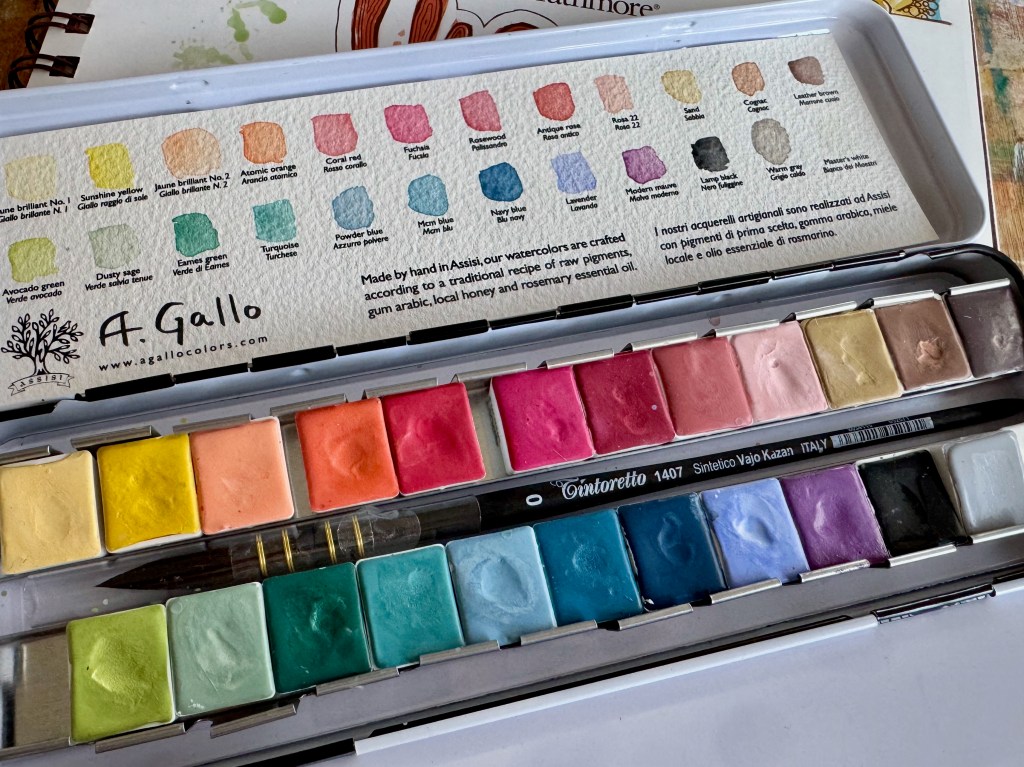
Another palette of A. Gallo watercolors! This time it’s the Mid-Century collection, in 24 beautiful and vibrant shades. Very excited about the pinks in particular. And here I decided to put it to the test.
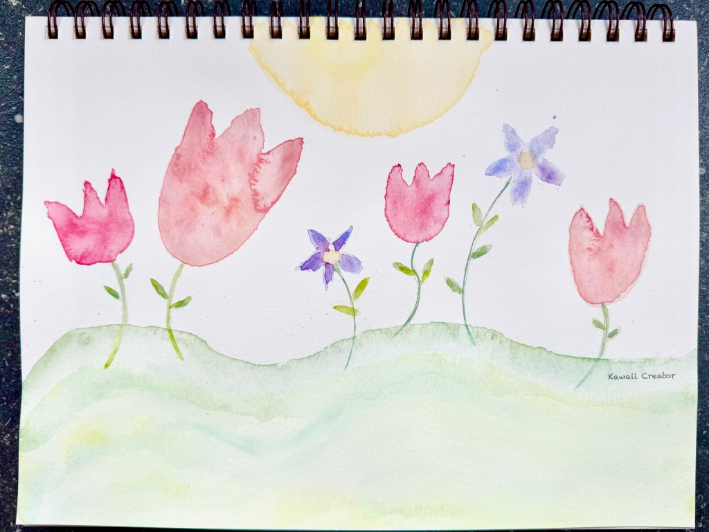
First experimented with painting some flowers on a page from Strathmore’s Visual Journal for Watercolor. Japanese calligraphy brushes were used for the paintings. Not very happy with how the composition turned out but love how the colors pop out: The violet, red and fuschia. That’s one positive thing! Love how the green colors on the ground feather together wonderfully too. So far so good!
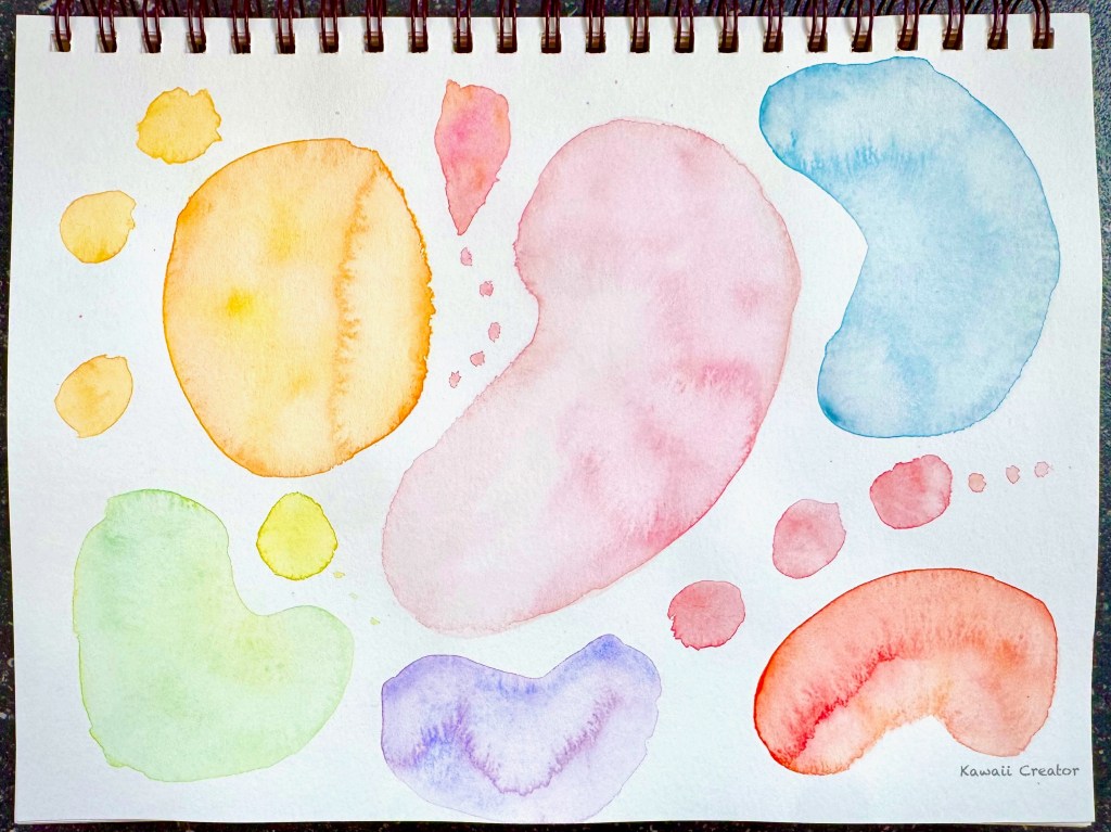
And now let’s see how the watercolors work for abstract paintings. With a limited choice of colors, focusing on shapes seemed a good idea so we could really appreciate the feathery effect of the colors as they organically merge together. I merely combined 2-3 harmonious colors in each of the shapes. Very happy with it and also love how this one turned out!
With the testing to my satisfaction, I am now ready to proceed to some real painting! Planning to paint Little One all pretty and colorful and see how that works out. I’m sure she will look very cute too! And in between my Procreate lessons, let’s see if I can squeeze in some a session to create more cutness…
