

What are the things you miss most during wintertime besides the warmth? I myself miss seeing flowers and cats! Obviously, flowers are virtually non-existent during the cold months, but what about cats? Seeing less of them roaming around outside. They definitely dislike the cold! And thus I thought I’d make a little painting about them whilst having a practice drawing cats in different positions and experimenting with combining watercolor and gouache.
Pencil Sketch
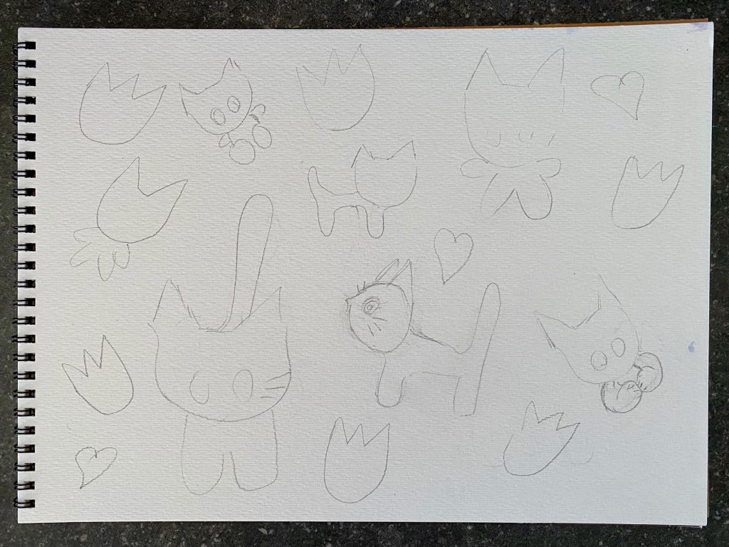
And here on my Strathmore sketchbook for watercolors, I set about my doodles. A random spread of kittens around the page, in all shapes and forms. Tulips were the flower of choice as they represent where I live, the Netherlands. Then where there was space, I introduced hearts.
Translucent Watercolor Background
Here I decided to paint the background with watercolor. This time, pastel-shaded colors were used, and a great opportunity to try two different brands which have this range: Derwent in pans and Holbein in tubes. Both have beautiful shades and since I couldn’t decide which one to go for, I chose Holbein’s compose green for the upper part and Derwent’s turquoise green #09 for bottom. So far so pretty, and oh so springtime!

Gouache and Watercolor
I do love that washed out translucent appearance of the background as my aim was to get the subjects to pop out more. To further enhance them, I opted for a medium with a chalky matte finish. Gouache of course is the first that comes to mind, but I also wanted to experiment with a new product Holbein recently came up with: Opaque Cake Colors which are a pan set of watercolors that give that heavily pigmented effect, similar to gouache. For comparison, I painted with both of them. Can you tell the difference? The light grey cat and the two different shades of pink tulips were with Holbein’s Gouache (pure gouache, not to be confused with Acryla) and for the orange and darker cats and red tulips and hearts, the opaque watercolors. Pretty similar, isn’t it? And how stunning they turned out to be!

Finishing Off
The whites of the eyes then were drawn in with white gel pen. To clean up the edges a bit more, I filled in the empty spaces and traced over the outlines with closely matched colored pencils. And here we are now!

What a fun and kawaii session that was! One of those days when you just sit down and doodle what comes to mind and then develop it into an even cuter colorful painting. Also a great chance to try out new products or go back to existing ones and enjoy. Now that the spring is approaching, I shall definitely be using these bright vivid colors more, both watercolor and gouache. Looking forward to painting more kawaii in bright and vivid!
