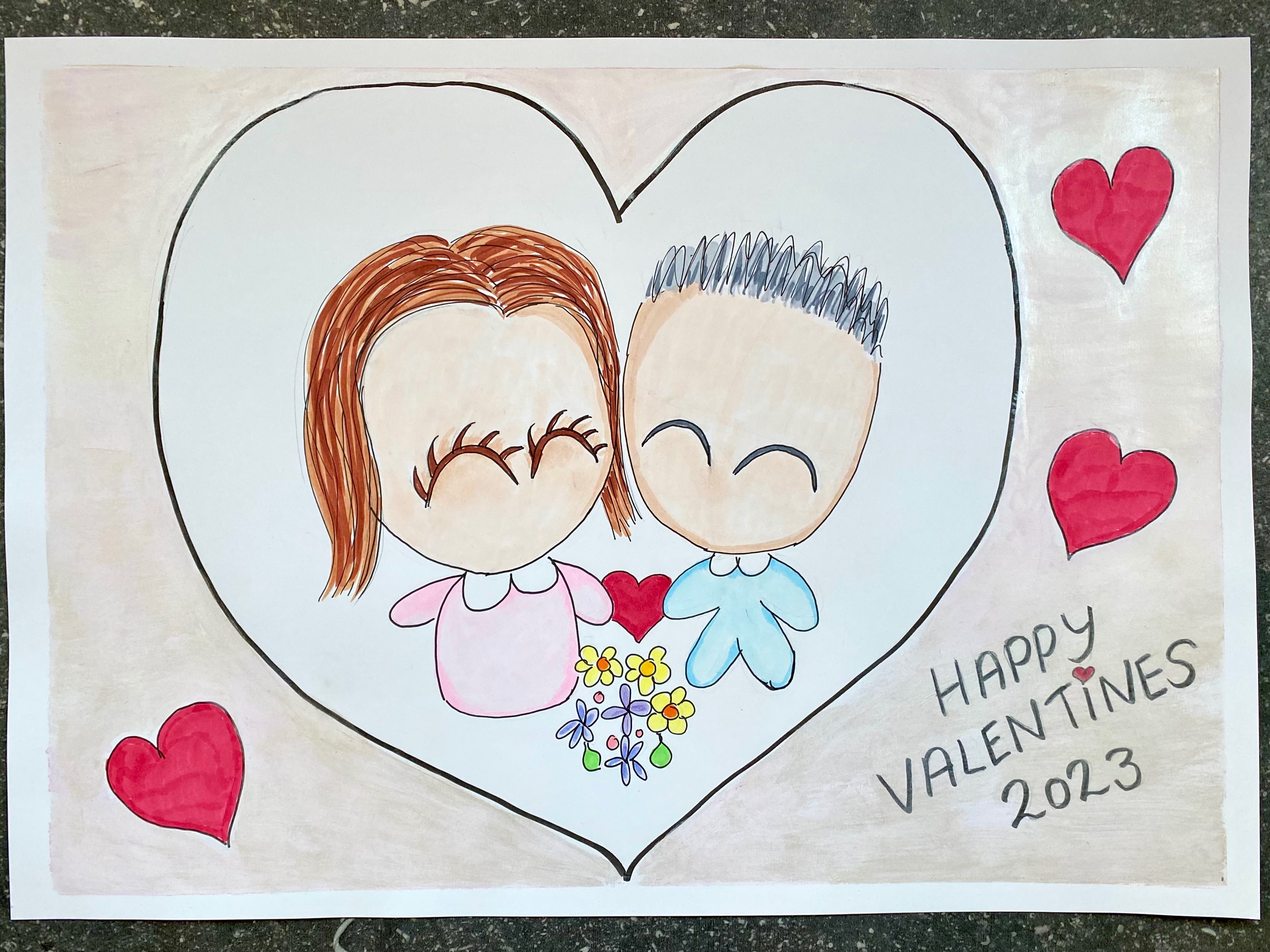
Oops, I nearly forgot! Nearly forgot that Valentine’s Day was coming up. It’s not really that big here in the Netherlands, and when I got flustered, my Dutch boyfriend reassured me, “Oh but everyday is a Valentine’s Day for us!” How sweet of him to say that! Nevertheless, we went out for a pre-Valentine’s Dinner last night. And I even interrupted the next art project I had just been starting to make way for this painting I made for us!
The Sketch
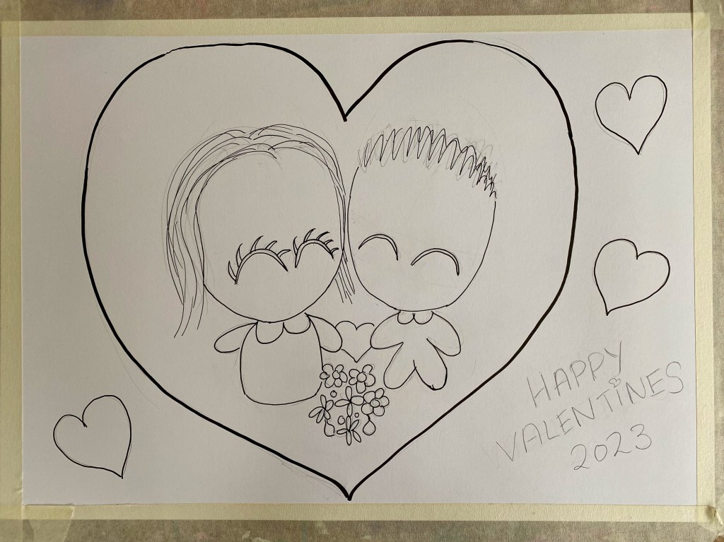
A few new products and art supplies to try out here! Recently I got myself a large A3 size pad of Canson’s Bristol Paper which would be handy for marker sketches, especially Copic Markers. I was hoping it would be thicker than 200gsm but that’s fine too and acceptable for marker sketches. A pencil sketch was then followed by tracing over it with the newly purchased Copic Multiliner set in black which come in varying thicknesses. So here we are, standing romantically glancing at each other with a bouquet of flowers in front of us and enclosed in a heart. So far so cute!

Copic Markers
Copic Sketch markers were chosen for coloring in the sketch. I have quite a limited selection of these markers and made do with what I have. Still, the drawing came out as I liked although I could do a bit more practice with light and shade and minimizing streaks. The ink, though, does come out in smooth and even consistency, and now I can understand why Copics are popular among professional illustration artists!

Watercolors
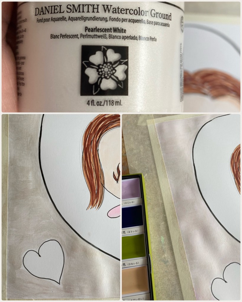
Colored pencils are quite often used in conjunction with markers, but how watercolor? We all know that markers, especially Copic pens, work best on smooth paper that is coated so the paper doesn’t absorb too much ink. However, such paper is totally useless with watercolor which requires absorbency as you just end up with puddles of paint. Enter Daniel Smith’s Watercolor Ground which acts as an absorbent base coat on any surface to enable painting with watercolor! Sort of like Gesso but porous. For the first time I decided to get brave and apply some with a dry brush on the background of the painting, opting for the Pearlescent finish. I let it dry then brushed some light pink Kuretake Gansai Tambi watercolor. And wow!

Colored Pencils
Once done and dry, I went over the writing and black lines with colored pencil. Markers on paint tend to damage the pen nib so best avoided especially on rather pricey ones like Copic! As for the background color, the light pink on the pearlescent ground resulted in a rather muted rose gold. I was hoping for something more vivid than that and in hindsight, maybe even gold would have been a better choice. That said, I didn’t want the background to outshine the kawaii sketch of us, the centrepiece of this painting. And hence best not to fix anything that ain’t broken. So here we are!

A bit different from my usual style of strong vivid colors, this painting will take some time to grow into. Interestingly, though, I am very pleased with it! I see it as another way of exploring beyond my comfort zone by experimenting with new products and subconsciously landing on muted tones this time. And of course, the main focus is about me and him, so the softness and subtlety enhance the romantic mood. Happy Valentine’s Day!

