

It was Hello Kitty’s birthday yesterday on 1 November. And what a perfect timing since I was thinking about revising an old painting I made about her more than a year ago. It is a watercolor painting on sketchbook called Bird in the House! Although it was completed, I was not sure at the time if I really liked the result and was at lost as to how I could enhance the painting. I promised myself to come back to it but alas it got cast aside as time went by and other projects took over. Finally I got around to tweaking it with some gouache and colored pencil.
The Original
So what is this painting about? Here is the story: I came home one day and was told by my boyfriend that a small bird flew in the house! It was a sparrow, I am told. How it got in he had no idea but it may have sneaked in when we had our front door wide open and never noticed it. Apparently, she was discovered as she was fluttering her wings in my designated Hello Kitty room of all places! The poor sparrow must have been so frightened to see all the cat-faces of my Hello Kitty plushies. As soon as my boyfriend saw her, she flew away past his study, up the spiral stairs and into the connecting attic before finding freedom in one of the open windows. No damage done, even my Kitties stayed intact. They too must have been startled! And there came an inspiration for another painting!

The Changes
To be honest not much needs to be changed. The only thing is that I felt that the vivid colors of the flowers and the ribbons were too overwhelming and hid the Hello Kitty’s a bit. This was because I was using Kuretake Clean Color watercolor brush pens which, though resulting in gorgeous shades, made the entire painting look out of balance. Let’s see how we can fix this! First, I repainted the sky with some Holbein’s Acryla Gouache in Aqua Blue. Then rather use more paint for the rest, I went for colored pencils instead. Not aquarelle pencils but the wax kind. They work very well together with watercolors and come in handy when you want to trace over lines without having to use markers which can come out too strong. Here, Caran d’Ache Pablo was used. Now that’s much better!
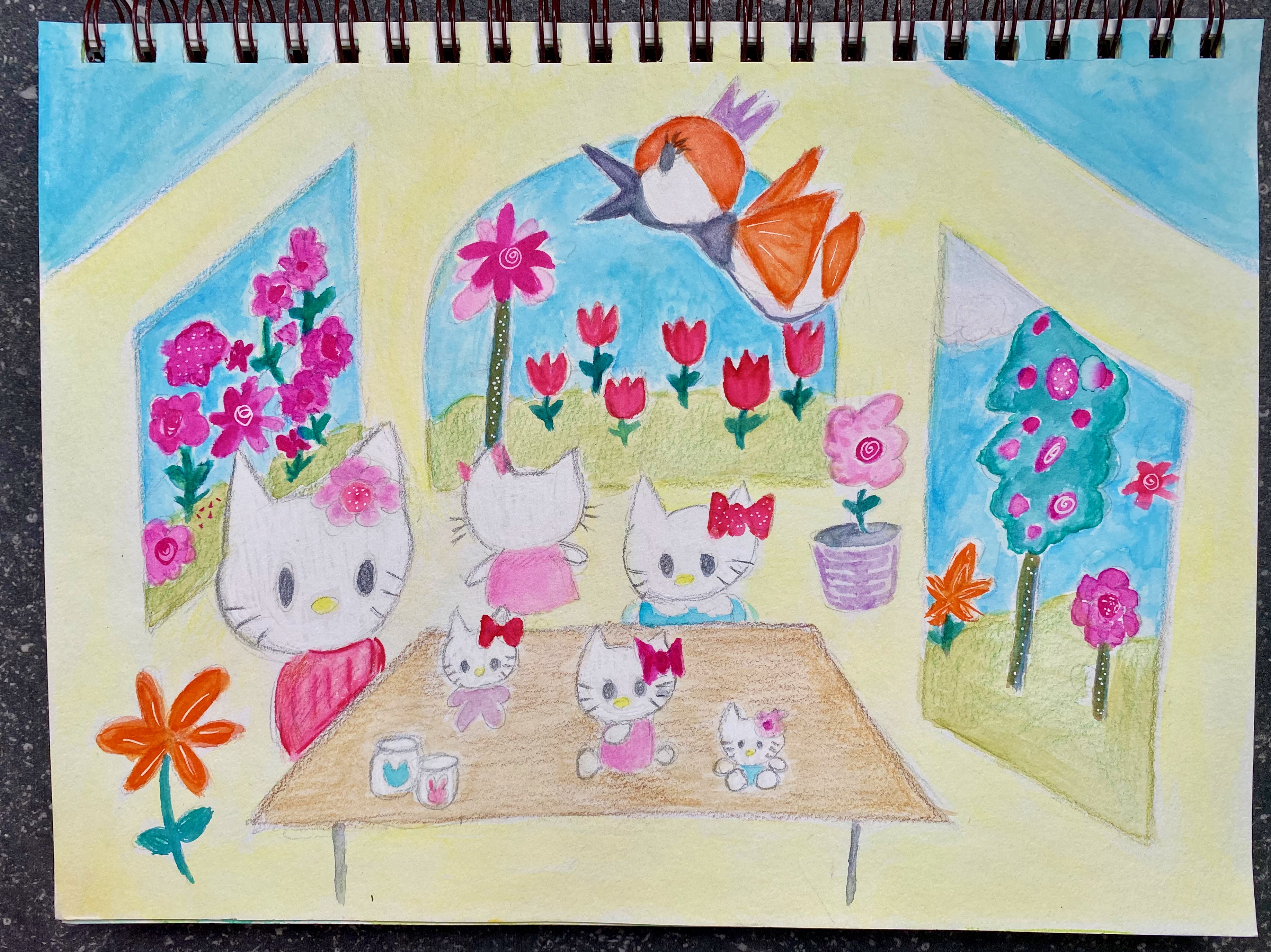
Although the difference between the original and the revised is not very obvious, I do notice a better color balance. You can also see how the Hello Kitty’s pop out more which was the main reason for me wanting to work on this painting again. And should I finish off with some glitter or shine as I typically do? Not sure if they even go well with watercolor. I quite like the sheer and subtle finish of watercolor painting and prefer to leave it like that. That said, it would be interesting to see what happens if I were to digitally enhance the painting by importing and then incorporating texture. What an interesting project that would make! Oh and before I forget. Happy Belated Birthday, Hello Kitty! Next year I shall remember to dedicate a painting for this special day…
