

Today I’m sharing you a painting I made a few weeks ago whilst following Lesson 3 Chapter 4 of Tracy Verdugo’s Story Painting Class. We made a Chagall-inspired piece with the theme “The Art of Celebration”. And who is Marc Chagall (1887-1985)? A French artist of Russian-Jewish origin, he was a famous painter from the first half of the last century more in the modernist domain. What made his work so striking was the simple use of colours, in fact by a limited palette of only two or three. For more about Chagall, click here. Whilst adapting his style, Tracy also had us choose a happy celebratory moment in our life. I of course had a few but the most recent that comes to mind is when my boyfriend and I decided to move in together and buy our dream house last summer!
The Colour Palette
Emphasizing the limited palette of colours, we chose contrasting primary colours of yellow and blue as basis. That way, we can also blend the two and create some green where needed. A neutral colour of Antelope Brown was also included so we could play down the monotony. Green Gold was also a wonderful choice too as it falls somewhere between the neutral and the green to bind further the yellow, blues and brown together. I went along with Tracy’s choice of colours but for some of the blues, I didn’t have so went for some substitutes. Interesting enough, although I do use these colours in my work, I now needed to resist the temptation to sneak in some red or even pink which would have enhanced the kawaii-ness of the theme. So let’s see what we can create here!

Pencil Drawing
And now we begin our pencil sketch! Here I used Canson’s A3-sized watercolour paper and a navy blue aquarelle pencil (Caran d’ache’s Prismalo) Although Tracy refers to some photographs she has taken to get ideas for sketching, I tend to go by imagination and what’s on my mind. I guess everyone is different and that’s ok. It’s me and BF happy and behind us is our new house! We just got some roof windows installed so our attic can get some added light and space. It’s also a place where he could build his dream “home cinema” and extensive hifi system to listen to music, whilst I can use the available space as an extension to my Hello Kitty “museum”! As our house is in the countryside surrounded by nature and a farm next door, I drew a cow, a cat and a bird. In the warmer months, the cows come marching in a single file along the path overlooking our back garden. And as a keen bird watcher, my BF is pleased that we get a wide variety of species appearing now and again. Then there is the neighborhood cat…

Painting Starts!
Once I was happy with the sketch, we begin to thicken the outlines in some places and adding some shading with some blue, starting with Marine Blue. It was important to vary the thickness of the lines and where needed, add some blocks of colour. To make the colors lighter, all I had to do was dilute the ink with a wet brush. I also began integrating some Prussian Blue and a bit of Ultramarine Blue. Once that was done, yellow was introduced where I wanted some brightness, ie the flowers and the lights in the attic. I played it easy on the Green Gold and limited it to the leaves and some areas of the grass. I preferred that the blending of blue and yellow take its course. So far so cute!
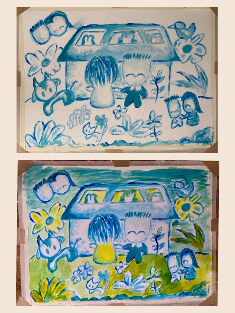
Final Touches
I continued painting with the palette colours I had. It was a matter of combining and blending the available blues and yellows, just freely coloring away and using my own instincts to see what needed doing. If I thought it was too blue, for instance, I added some yellow, and vice versa. Only the cat was painted in Antelope Brown as an accent, as were the faces on the left corner blended in with some titanium white. I used the white as sparingly as possible, resisting the temptation to use it to blend with the colors as that would result in a pastel shade which I wanted to avoid. White was only used for areas that would remain white, including some dots and streaks using a marker. After layers of alternating among the limited blues and yellow on the palette, I was able to create a range of different shades that worked harmoniously together. Just love this harmony! And here it is, my Chagall-inspired painting of celebrating our new house!

I loved this lesson with Tracy! Probably one of her best ones. It’s not often I adapt my work to another artist’s style but it was fun! What made it interesting was discovering what you can create using just a limited palette, in this case just one yellow, three kinds of blue and a bit of brown. As I said earlier, there was no using my favorite colour of pink. And yet the painting remained amazingly kawaii without it. Another opportunity to explore beyond my comfort zone! Drawing sub-sketches within a single sketch was also another thing I never did, ie randomly scattering three versions of me and boyfriend or oversized flowers in the sky. What an interesting composition that made! I would definitely do a similar sort of painting again. Perhaps, for example, if I were to combine of red and blue for instance? I would love to paint more happy stuff like this!
Click here for more about Tracy Verdugo and her amazing classes!
