

Today is my boyfriend’s birthday! And since I began painting a couple of years ago, I’ve been making a special painting for him every year! I enjoy it, and it makes him happy. This year, I went for a much larger paper (40×50 cm) and incorporated a more abstract feel to it whilst of course retaining the kawaii. The idea comes from my artist friend Tracy Verdugo with the intuitive layering and negative space.
The Writing
I began by scribbling “Happy Birthday” in English, Japanese and Dutch using my oil pastels. For those interested, it’s just a set of cheap ones I got in Japan “Cray-Pas” by Sakura. Apologies for the bad photo and not so great handwriting but here it is:

Layers of Background
Acrylic inks were again used for this painting and, for the first time, along with a water spray to disperse the colours. At this point, I didn’t want to make the painting too pink and red and hence too feminine as it’s for my boyfriend! Striking a balance was part of the challenge. This meant I had to play down on the girliness and incorporate some masculinity without losing my character and kawaii vibes. I felt blue would be a bit cliché so I went for purples and yellows. Somehow, I was hoping to incorporate more blue later, perhaps as negative space background.
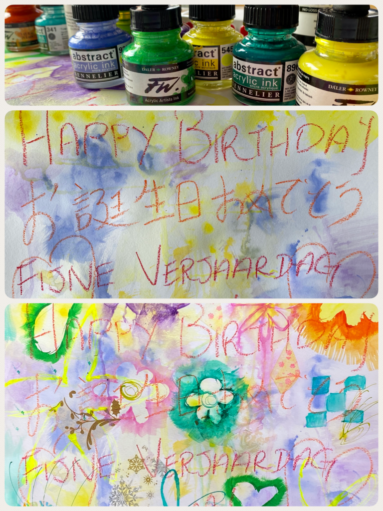
As I progressed though, I began reverting to my feminine self whilst pinks and flowers were added. Oops I thought but not to worry, I can always fix that. Orange and greens were then introduced as were collages of paper napkins and deli paper prints I had made some time ago.
Creating Negative Space
Once I was happy with the background and not wanting to overdo it too much, I set about my idea. I once again outlined it digitally first with my iPad. This is such a good idea because it gives you an opportunity to see what works and you can erase areas when you change your mind. Also with all the chaos of colours and shapes on the painting, it’s just easier to visualize it on a screen.
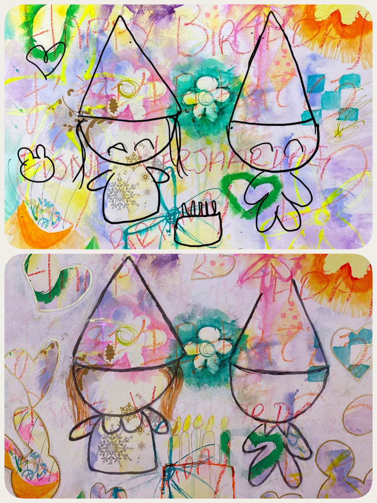
Bottom: Outline on painting
- As you can see from the above photo, I was able to “transfer” my ideas from the digital version straight onto the painting with minimal difficulty. The secret is to match the locations together, say a certain corner of a flower, and work your way from there.
- Now I did divert a bit by adding more shapes to fill in the space but the important characters are well placed. I used Payne’s Grey ink to outline “me and my boyfriend” and for the surrounding shapes I drew with Pebebo Deco marker in gold. The cake I made bigger and outlined with Fluorescent orange ink.
- To paint the negative space area, I initially considered blue as I had mentioned earlier. I couldn’t come up with a suitable shade of blue, unfortunately. Also the overall painting already has cold tones to it so adding blue would emphasize it more. And so I decided to go for Titanium White and figured I can always embellish the painting later.
Making it Look Pretty
- I drew in the hair with two shades of brown water-soluble oil pastels, Neocolor II by Caran d’Ache, and blended them with a wet brush. Once dry I added streaks of Antelope Brown ink directly with the dropper.
- Brightened up the painting more with fluorescent shades of ink, even some pink in the flowers. Neon yellow and orange as well as gold on the candles
- Some pastel shades from Holbein Acryla Gouache were dotted in areas to soften the mood
- Glued in bits of scrap origami paper as seen on the cake and boyfriend’s hat. Also a flower was cut out on origami paper with some craft punch and added on the side to fill in a big empty space.
- It’s his birthday, so of course we need to add some bling to bring out the party mood! Glitter glues in various colours were incorporated in random areas including the eyelashes and parts of flowers.
And now… I think it looks wonderful!

I showed my boyfriend, and he loves it! It still manages to be a “his” birthday whilst retaining the sweet kawaii elements. It also manages to look plentiful without being overwhelming. And now we are thinking of having this painting framed and hung in the bedroom for sure!
