

After my positive experience with the Pan Pastels, I decided to go ahead and invest in more colours, adding 20 basic ones to my collection! I only had the pastel tints and metallic colours up until then for the intention of using it just for backgrounds. Last weekend, I then decided to try out my new toys! I didn’t have the chance to share this kawaii piece I had created earlier, as I was churning out the Valentine’s Day series instead throughout the week. For this piece, I chose another Snow Polo theme because we unfortunately had to miss out on the event that weekend. I then thought it would be an idea to draw one last one as the season comes to a close!
Outlining
For this piece, I used Strathmore’s 400 Series Pastel Paper (118gsm) which I totally recommend in terms of its reasonably silky texture despite its firm tooth. A good tooth grips the pigments and allows them to adhere which this paper does well. Pan Pastels work best with pastel pencils especially for the small details and sharper edges as well as for outlining your drawing. The beauty of it is that compared to graphite pencils, they can get erased better without leaving marks or imprints. However, they do smudge quite a bit so for the outline, so it’s best to opt for a colour closest to the colour scheme of the painting. I, for instance, used light brown because much of the brown horse is likely to dominate the piece. And once again, let’s make the polo player all kawaii and happy!

Lavender Background
It’s always advisable to paint the background first. As such, this is a good time to think about colour scheme from the start. I tend to make that mistake, adding whatever comes to mind and then getting stuck with what colours are compatible. Here, I decided to go for a light touch of Purple. I may have even mixed it with Violet Tint too. Just took a medium sized sponge and lightly smudged away. When getting to the border of the outlines, then use a smaller sponge with an angled edge.

Oops, Wrong Colour Scheme
The process of applying the colour with sponges went smoothly. As said in my earlier blogs, I really love how the colours immediately glides on strongly without having to press hard. However, I made a bit of a boo-boo with the colours. I thought of going for yellow and green to create a triad complementary colour scheme with the purple. So I made the mask and saddle of the horse yellow, the reigns and the hat green and the outfit orangey yellow. Only the shoes would be purple. I was not happy at all with the result, though. Firstly, the combination of green and yellow represents the colours of my high school sports team which I hated at the time even though it’s been over 30 years haha. Then the orange is colour of the Dutch national soccer team, and it really looks wrong with the snow polo. And the purple on the shoes only just looks really silly.

Let’s Fix It
So what to do? Well, staying calm is a good start. And then erasing and starting over of course! Another wonderful thing about the Pan Pastels is that while the colour stays strongly on the paper, it’s so easy to erase. I just took my squishy artist’s eraser and gently tapped the areas I wanted changing. The yellow of the horse mask and saddle stayed. As I loved the green of the hat and how beautiful it turned to that soft jade shade, I kept it. However, the reigns, were switched to purple to match the shoes. For enhancing the purple, I combined the Pan Pastels with pastel pencil. And the outfit I made magenta. I think that’s more my type of colour, as I’m always drawn to anything pink! And the polo stick a woodsy orange. For adding shadows and shading, I merged some of the colours reflecting the areas, ie., a bit of green or purple on the horse and bluish shades on the outfit and hat. Pastel pencils came handy for drawing in the eyes and giving the hair some dimension. Et voilà. Now I’m happy! I like the contrast between yellow and violet but also with the green as triad shade to add some further accent.
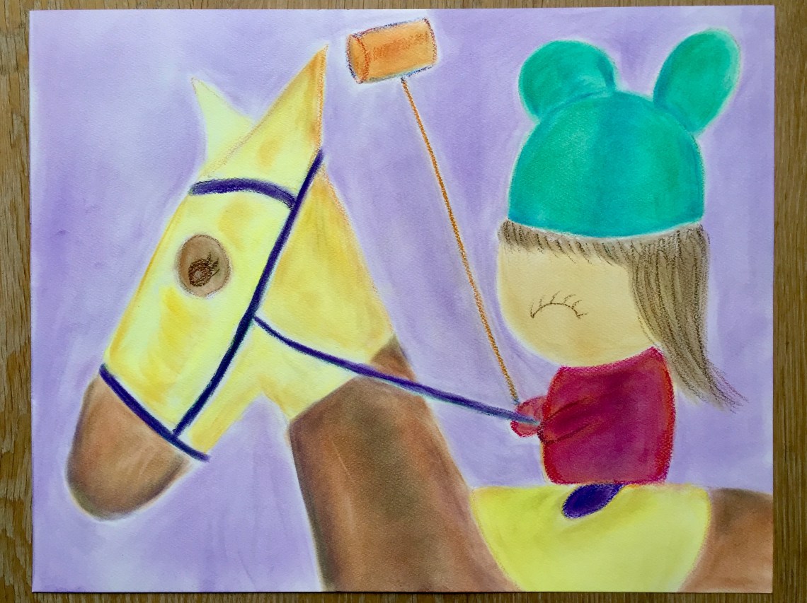 It’s a simple piece this time, given I’ve just started using Pan Pastels. The session was about practicing the techniques of applying and getting accustomed to it, as it’s a totally different experience compared to say holding a paintbrush or pen where you have better control. Furthermore, it was an opportunity to master colour scheme more and to experiment what works best as seen with what had happened. Another thing worth adding is that from a mental perspective, it taught me not to panic when things don’t go as planned. Just find a solution and work on it till you’re happy. I am, just like the kawaii Polo player is!

“Just find a solution and work on it till you’re happy”. I totally agree, have a great weekend!
LikeLiked by 1 person
Thanks and you have a good weekend too!! 🤗
LikeLike