

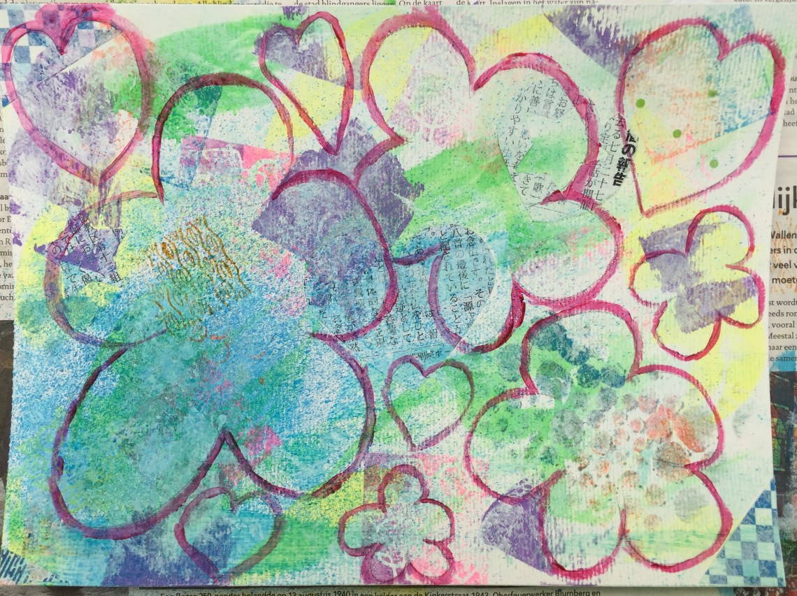
Today I was not sure what I wanted to paint but was in the mood to do something. I thought of some kawaii characters but was not sure where to begin or what theme to go for. So I started off by a few drops of Ecoline ink (#205 in Yellow and #600 in Green) on some mixed media paper.
 Then I just started getting into the groove but with little direction. But what an adventure! I began adding layers of scraped lilac paint (Laidback Lilac by Dylusions), rubber stamp imprints, collages from bits of origami paper and cutouts from a Japanese-language newsletter and stencilled ink. Then a spritz of ink spray (in London Blue) on the bottom left corner.
 So far so cool but what next? My original thought was to draw some kawaii characters like little girl doing something but not sure if the snazzy background suited that. So I thought, why not flowers? I liked the vivid colourfulness and thought that flowers would be a better fit. After a light layer of white gesso, I began outlining some flowers and hearts in magenta paint randomly around the paper, carefully making sure that the shapes would enclose the prettiest bits. I did regret a little using white gesso in the end and wished I had retained some of the bright colours but figured I could make up for it later by layering more colourful details on top.
 Not having an idea as to the background, I thought I’d experiment using some grey. In the past I did a flower painting using black paper called Midnight Blossoms, and it came out really nice, so I thought it might be nice to try grey as well. I used Dylusions acrylic paint in Slate Grey, and I must say it looks quite chic. Also liked the way this paint could be applied on directly on paper and gives an even and opaque coverage, which was my intention.
 I cleaned up the outlines a bit by repainting them. At this stage, I was not sure if I should leave the painting as it is or add more layers on top with more ink stamps and collages. Decided to take the risk and glued a number of flower-shaped cutouts from some origami paper . Unfortunately, I placed a large sized one where the biggest flower is but I didn’t like how it overwhelmed the painting so I covered it up and painted over it. You can still see the patterns below, but that is fine because they manage to blend in with the original background. As for the rest, the cut-outs were well positioned and discreet as they were placed in the background so blended in better. I also used some ink stamps in orange, pink and blue. And here we are!
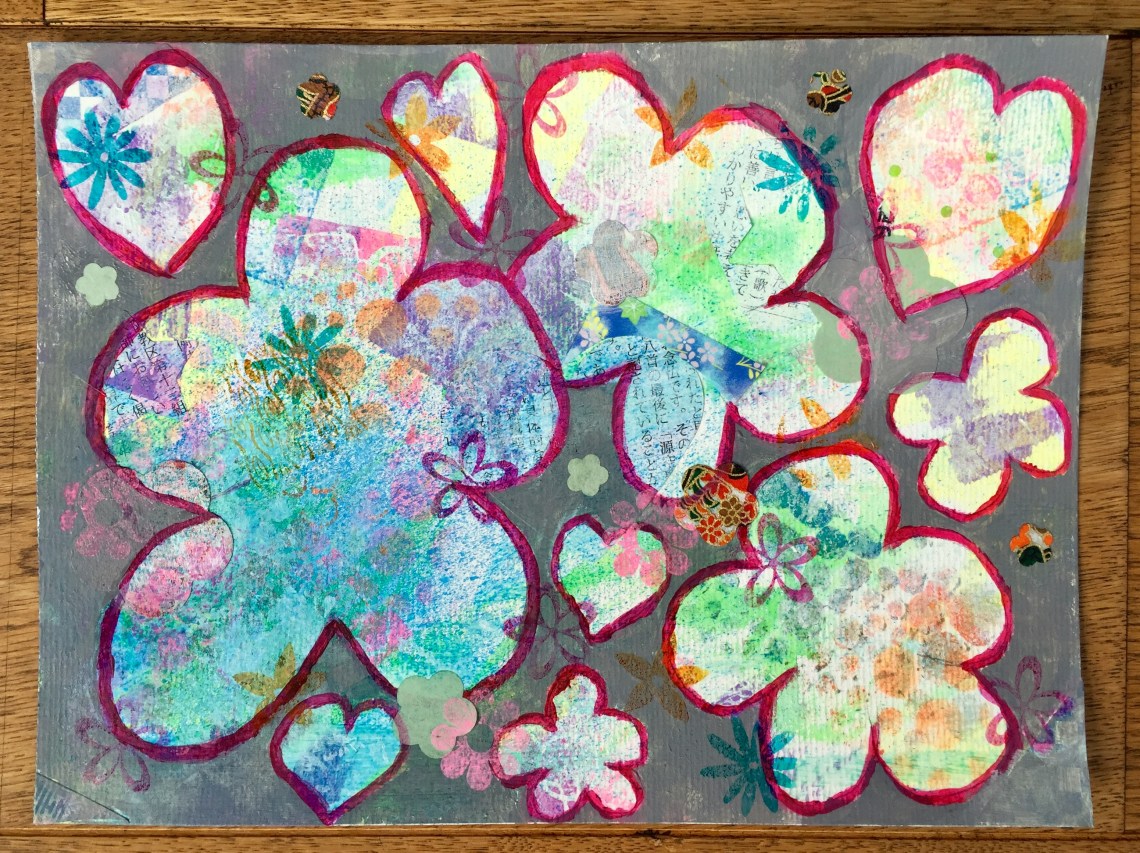 Today was just another “let’s see” day for painting. Experimenting again and exploring possibilities as the work progresses. Am happy with the grey which is quite a change from my normally vivid and bright-coloured backgrounds. Besides, it’s most probably a sign that the summer is almost over and our last chance this year to see beautiful flowers before autumn comes. And then will come grey skies again…
