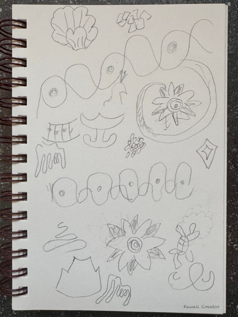
Continuing from my previous blog, Symbols of Isola Bella, I decided to apply these symbols I had spotted in that lovely Italian Borromean islands on my abstract painting! And why have I selected that particular area for this? Well, what made this place so special is that last August my family from Japan was over in Italy for vacation, and we decided to meet up with them there! Upon exploring Isola Bella during a day trip, I was intrigued by the stunning sceneries and also the interesting symbols at the palace which I then ended up photographing and jotting down in my sketchbook. And in turn that got me inspired to make an abstract painting featuring them!
The Background
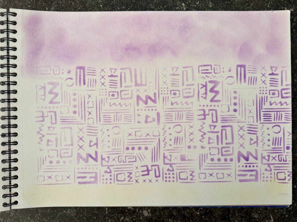
So where to start? Upon tidying up my desk drawers in my art studio, I stumbled upon an old artwork I had started but never gotten around to completing. Or it was more like a scrap page from a sketchbook on which I was wiping off some purple Ranger’s Distress ink to clean my stencil. This was on an A3 Canson’s Mixed Media sketchbook. Rather than throw it away, though, I figured that would be of some use in future because I really loved how cryptic it all looked! I put off going further with it immediately though since I wanted to save it for a suitable opportunity. Upon moving homes, though, it got stashed away in a box and for years was forgotten. Now that it turned up, this is the perfect time to make some use of it!
And Here Goes…
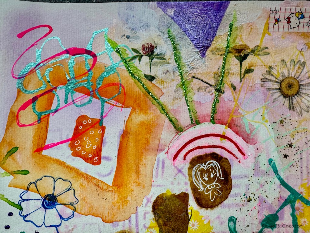
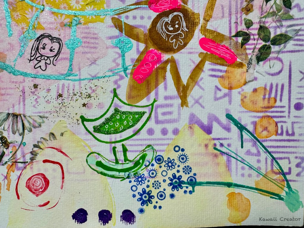
This is an idea I had adopted from Tracy Verdugo‘s art classes when creating our abstract paintings. Firstly, we could base the “odd shapes” by observing symbols, something we come across during our travels or even our daily life. And now, do you see some of the symbols I had jotted down in this painting? Another of Tracy’s idea is thinking in “contrasts” to keep our minds flowing as we paint. Examples of contrasts would be light and dark colors, straight lines and curves, angular and circular, thick and thin and so forth. A great advice if you ever get stuck in the middle of painting. Other ideas include mark-making with stamps and stencils as well as using collage papers. I also used textures such as glitter here. And of course I included mini versions of Little One. How could I not include her? She is having so much fun in Isola Bella too!

Mediums Used
Seeing that this is a mixed media painting, a wide range of art supplies were introduced here. Basically, I went for acrylic inks, including pearlescent ones, as they are so versatile and create opacity compared to paints. Then we have Holbein’s Acryla Gouache which, though acrylic-based, gives a thick matte effect. Gel pens and acrylic markers were also used for finer details. I also went for rubber stamps with Staz On ink as well as a variety of collage papers like paper napkins and even Hello Kitty washi tape! As a finishing touch, of course, I love playing around with glitter.

The painting took a few days to complete as I was working on and off it whilst working on other projects at the same time. Sometimes, I got stuck and was unhappy with the progress. There were times when I wanted to toss the painting away, but I refused to give up. What helps in times like this is to shift focus on another artwork and come back to it with a clearer mind. And I must say I am proud to have persevered! The painting itself may be a chaotic mishmash of “strange” shapes scattered around but it is reflects the wonderful adventure of Isola Bella I was so fascinated about. And featuring LIttle One is the icing to the cake!
Would you like to see some close-ups? Please click on the gallery below!