

Just before we took off for our vacation two weeks ago, we went for a stroll in the wonderful Dutch countryside. It’s the season for Heather! Beautiful view of these violet flower fields at the Hoge Veluwe area, a nature reserve in the middle of the Netherlands. While we were at it, we came across some ponds filled with water lilies and their leaves. What a gorgeous combination, I thought, that I had to paint about it when I got home!
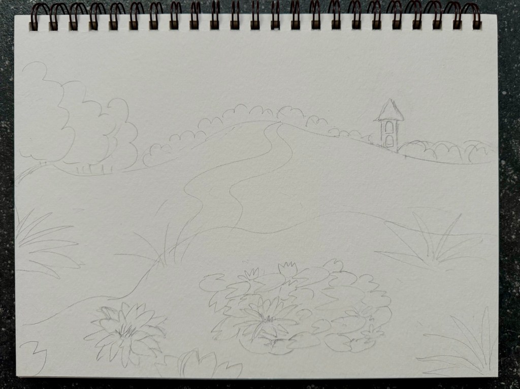
Pencil Sketch
On an empty page from Strathmore’s Visual Journal for Watercolor, I set about my pencil sketch. Just a landscape painting this time…
Starting with Earthy Colors
For this painting, Kremer’s Pigment Watercolors were chosen. This brand, from Germany, produces pigments derived from natural minerals, similar to Japan’s Kuretake Gansai Tambo. The Earth Colors set seemed perfect for this purpose, starting with the background. Whilst I went for the Japanese calligraphy brushes, I added texture for the Heather field using a damp sponge dipped in violet from Kremer Watercolor’s Hard Edge set. So far looking good!
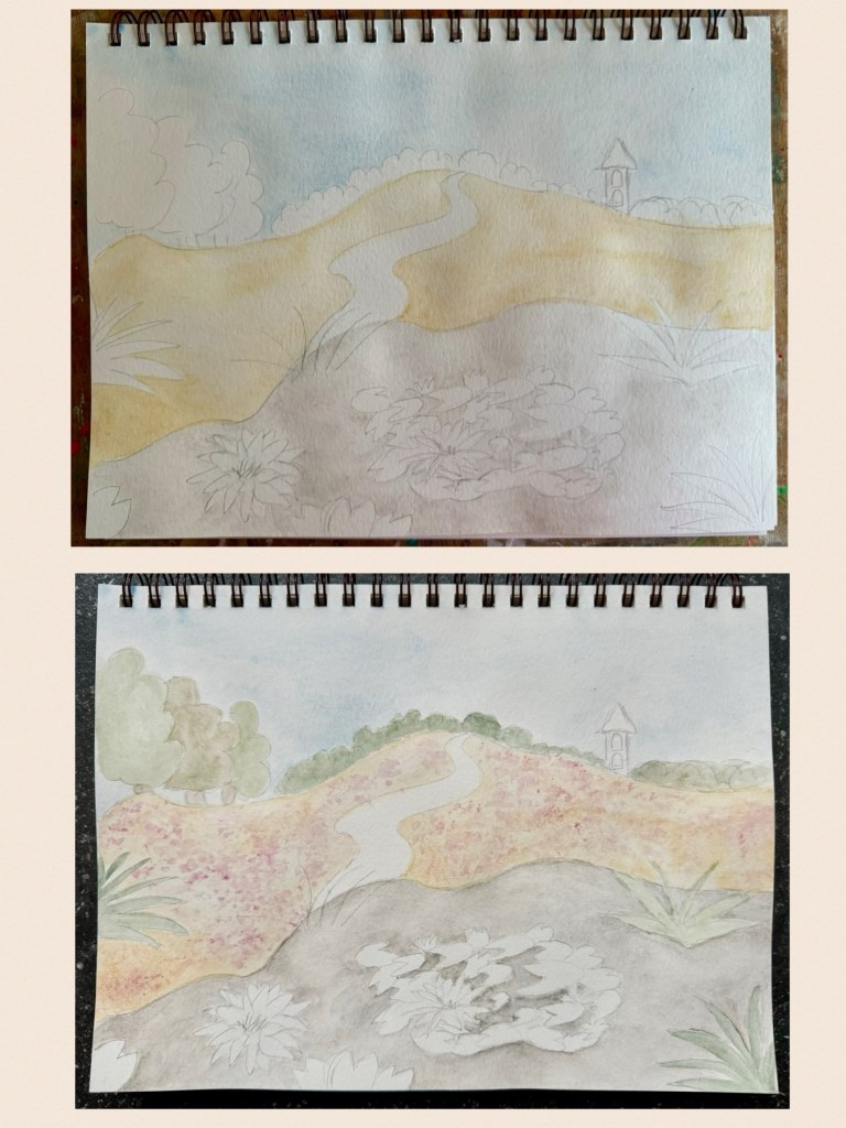
Getting Brighter
I then decided to introduce some vivid colors against the earthy backdrop. The tall grass and Water Lillies were then colored in various greens from the Hard Edge set which is composed of a range of strong brilliant shades in contrast to the muted tones of the Earth Colors set. I even experimented with the pink from the Fluorescent Colors set and spread that a bit in the Heather fields to let the color pop out more. And here we are!
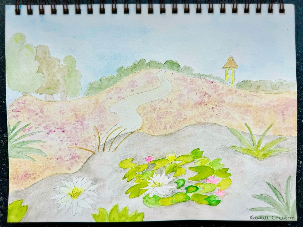
It’s not very often that I paint landscapes. A fun challenge that was, though, especially since I also got to try out my Kremer Pigment watercolors. I love them! The balance between the muted earthy tones and bright vivid colors also turned out rather well. Especially as it’s great practice, I do look forward to churning out more landscape painting!

1 Comment