

Despite my busy schedule, I try to attend on-line classes as much as I can. They help open up my horizons and by going beyond my comfort zone, I get to challenge my creative abilities. And here is an abstract landscape watercolor painting recently completed whilst following U.S. painter Alena Hennessy’s “Watercolor Wonders”, more precisely the unit “Rolling Hills”
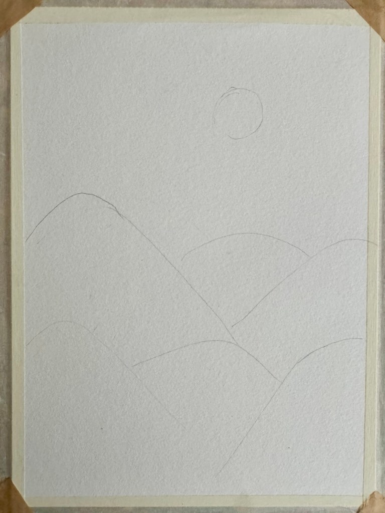
Pencil Sketch
Canson’s A4 Watecolot Paper was chosen for this painting, a wonderfully thick 300 gsm hot-pressed paper. After taping down the sides to avoid warping, I proceeded with a light pencil sketch as I’m not too experienced with landscape painting and wanted to get the composition correct. Just some hills of different sizes and forms with the sun in the sky. I was hoping to make this a sunrise scene too!
Painting the Hills
Once I was happy with my sketch, time to color it all in! One of the challenges was finding and painting with warm tones of brown and neutral tones like burnt sienna, yellow ochre and some crimson. They are shades I hardly opt for as I prefer brilliant ones. Luckily Kuretake Gansai Tambi (traditional Japanese watercolors in pans) has a wide selection of neutral colors. About three or four different shades were chosen for this. The secret is to lightly brush just water on the desired areas before tapping in the colors and then watching the pigments spread and merge together organically, repeating the process one hill at a time. Alena then further suggests a few drops of bright magenta most likely to introduce some liveliness and to neutralize the warm shades a bit. And here is what I did so far.

Painting the Sky
After some tweaking and adjustments to my hills, now turn to paint the sky! For this I went for Jane Danenport’s pans of watercolors as their selection of vivid colors are more extensive. And hence some bright blue and violet, once again using the same method of wetting the area first with water and then adding drops of the color and spreading the color lightly with a soft flat paintbrush. Now back to the hills, a bit of the fluorescent pink from this set of watercolors was also used for adding some accent to the hills. The painting was concluded by filling in the gaps between the hills as much as possible without the colors of one hill running to another. And here we have it!
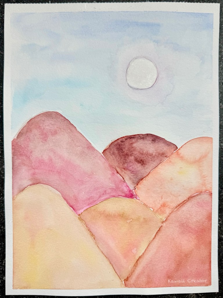
And I’m really loving this painting! Not bad for an early attempt at landscape art with watercolor. I love how the pigments move and blend to produce that marbly effect. Then there is the color scheme, something I am quite new too as browns and tans are not colors I normally go for. And although I was certainly challenging my comfort zone, I had so much fun with it! Look forward to my next class with Alena…
Please click here for more about Alena Hennessy and her amazing classes!
