

Little One enjoys playing with bubbles! And here she is, in her pink frock, happily playing with them with no care in the world, surrounded in peace and content by all the green and pretty flowers. Seeing how unpredictable the weather has been this Spring, she is hoping that this summer will bring more stability with tolerable temperatures. How sweet, and hence what a perfect painting this would be to cheer us all up: Something bright and bubbly!
The Background
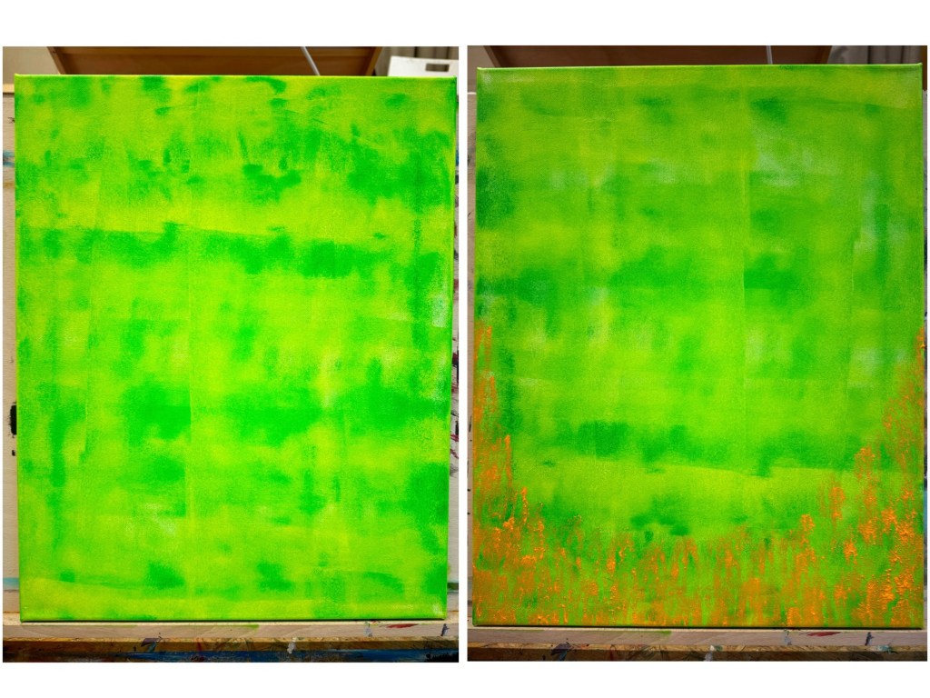
This painting was actually done during my Tuesday evening abstract art classes with Dieter Klassen. In this class, we were to play around with texture using plaster. Modellling paste could easily be used, but here we were to create texture in large areas. First we painted our background using a big brayer. A combination of yellow-green and permanent green were introduced here which resulted in a rich but vivid shade. Uncertain of the next step, I decided to take the plunge and try a layer of bright orange but regretted it because the paint did not came out as expected; I was hoping for a few spots but apparently I had too much paint on the brayer. Luckily, it did not get applied over the entire canvas but just partially on the bottom. And now I quite liked that! Once the paint dry, an interesting texture resulted. Now that’s what I call a beautiful mistake!
Getting Plastered
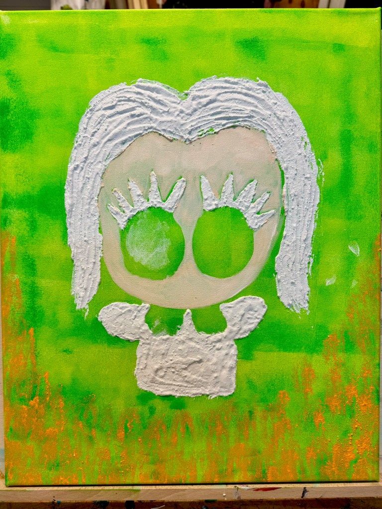
And here comes the plaster! Dieter mixed the plaster for us, and with a palette knife, we carefully spread it at the desired area. After having drawn my Little One with the pencil on canvas, I went for the hair, lashes and outfit, making sure the plaster was evenly and thoroughly applied. What I should have done in hindsight, though, was paint the face first before spreading the plaster to avoid the visible gap between it and the paint. Not to worry, we can rectify that. Compared to Modelling Paste, the plaster was a bit more fluid and less chunky in consistency. The result is that you get a more even application with less rough edges. As said earlier, plaster is more suitable for large areas as well. And now we let it dry and continue with the painting the next lesson!
Let’s Begin Painting!
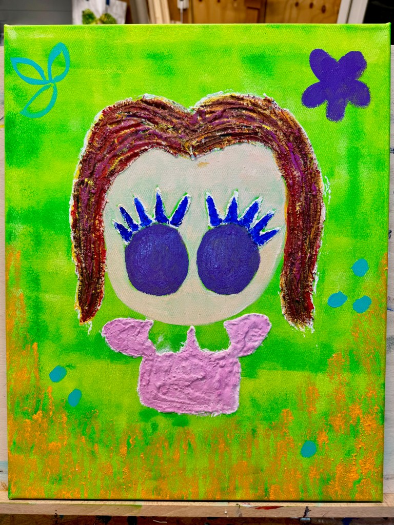
A variety of colors were used here including turquoise, cobalt blue, red, violet and magenta, all by Amsterdam Acrylics. I mixed and matched the colors to find the shades I wanted. Also it was important to create composition balance by knowing which colors to place where. For instance, the eyes and the large flower on the right hand corner were the same violet. The hair was so much fun to paint too! Rather than grab a brown paint, all I did was combine all the colors I had in hand and see what I can come up with!
Finishing Up
To tidy up the lash area a bit on the edges, I filled in the gap and white spaces with Molotow acrylic marker in dark blue. Extra-opaque White by ARA was also used for the whites of the eyes to make them pop out more. Ditto with the white collar. Then I dotted a bit of fluorescent pink acrylic marker on the turquoise areas, even adding some streaks of it on the hair. And let’s not forget the bubbles Little One is playing with! The painting was then concluded with a few glass disk beads, all glued with strong acrylic binder and let dry till I pick it up the following week. Et voilà, how pretty did this turn out!

Although it took a span of few months to complete this with the weekly lessons and sporadic holiday schedule, I had loads of fun with it. It must have begun even as far back in mid-February when we were all longing for longer days and looking forward to the Spring which alas turned out quite mediocre. At the time, something in me decided I needed some positive energy and power boost both of which indeed are reflected in this painting. It now hangs in my bedroom, where I can wake up to something happy. And think of Little One in her pink frock wandering aimlessly in the green and playing with her bubbles…
