

It is soon Valentine’s Day! Tomorrow in fact. And so I created a sweet happy painting for this occasion as I do yearly. As we are away much of the day tomorrow and going for a romantic Valentine’s dinner aftwards, though, I thought it would write about it now and share to my readers so you can see how much fun I had painting this!
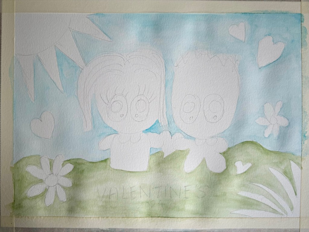
Pencil Sketch
Grabbed a large A3-sized Canson’s Watercolor paper and taped it down with masking tape to prevent the it from buckling. Then away with graphite pencil sketched away! Cuter the better and hence the two of us enjoying the sunny day surrounded by hearts and flowers. Although it’s still February, we dream of the spring!

Painting the Background
The intention was to make this a watercolor and partly gouache painting using some of the art supplies I had purchased during my recent trip to Japan. And what fun it was! First I wanted to try out my Harmonia Granulating watercolors. The blue turned out to be too dark, though, and hence a pastel shade from an existing Kuretake Gansai Tambi watercolor was chosen instead for the sky. However, I was happy I was able to find the Olive Safari from the Harmonia range a perfect shade of green. So far so pretty!
Fun with Colors
It is not often that I photograph and display here the mediums used but there was quite a wonderful selection and thought it was worth sharing. To paint the subjects, as you see, a variety of watercolors and gouache paints, both new and existing, was selected. Watercolor pans recently purchased in Japan include the Shadow range typically used when wishing to incorporate shading in your work. Another is the Black range which demonstrates the different blacks possible when blended with other colors. Both are I believe by Kuretake. The rest of the watercolor pans are Kremer Pigments from Germany which I already have. As for Gouache, they are actually acrylic based but emulate gouache by its solid matte finish. Ones I had purchased in Japan are the Pastel and Pearlescent ranges. Can’t wait to use them more often!

Coloring our Valentine’s
And now can you see which medium was used for which area? The sun and right hand corner plant were filled in with Pearlescent Yellow and Gold gouache. For our outfits, I went for Gouache in the pastel colors. This was followed by faces being painted with a selection of Kremer Pigments Skin Tone watercolors as I was also keen to practice with this set of pans. Then the eyes were filled in with the Black or Shadow watercolor sets (hence marked “e” in the photo above) which came out beautifully! I continued with the sets for my hair, marked as “h” above. For his hair, I went for the monochromatic range by Kremer Pigments. Gouache was then used for the emerald green and orange flowers, and the hearts were painted in red with Kuretake Gansai Tambi (not pictured above). As finishing touches, I filled in the whites of our eyes with Uni Posca marker and lined the lashes, flower stems and hand-writing with colored pencil. And now, how cute is that!
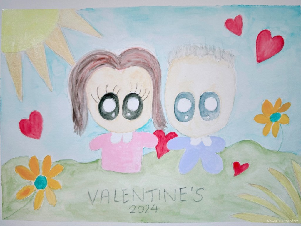
And here concludes my sweet happy Valentine’s painting for 2024! I hope my boyfriend likes it. Let him have a peak earlier during the process, and he told me how cute it was. Always wonderful to have a partner who can appreciate and fully support my creative hobby! I had so much fun too experimenting with my recent art supplies purchases and combining them with my existing ones. Watercolor painting is another medium I enjoy. And now, I wish everyone out there a Happy Valentine’s!!
