

And another classical painter inspired work! We now look at Johannes Vermeer (1632-1675), a Dutch painter from the Baroque period. Last April, we had the once-in-a-lifetime opportunity to visit the Vermeer’s Exhibition at the Rijksmuseum in Amsterdam. And what impressive work he had! What makes his work so special is his use of rich pigmented oil paints and choice of quality mediums. Unfortunately, though, the famous “Girl with the Pearl Earring” had to be returned to the original museum in the Hague so was not displayed at the exhibition. Not to worry, we will definitely make a trip there especially one day. And a great reason to create my own version of this famous painting!
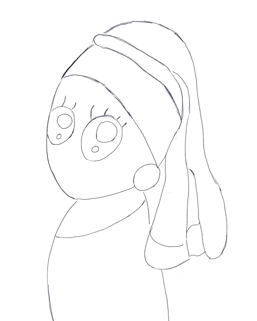
Pencil Sketch
Digital art would be a good start before I pursue a proper painting. Initially, my idea was pencilled in my small sketchbook. I was intent on a kawaii anime version of the painting, along with the exaggeratedly huge eyes and, as my style, no mouth or nose. The head is a bit more elongated compared to the sort of characters I draw, but I wanted a closer resemblance to Vermeer’s. Once good enough, it was photographed on my phone before being imported onto my Procreate app. The outlines were then closely traced over with the Procreate Pencil. So far so good…
Coloring Her In
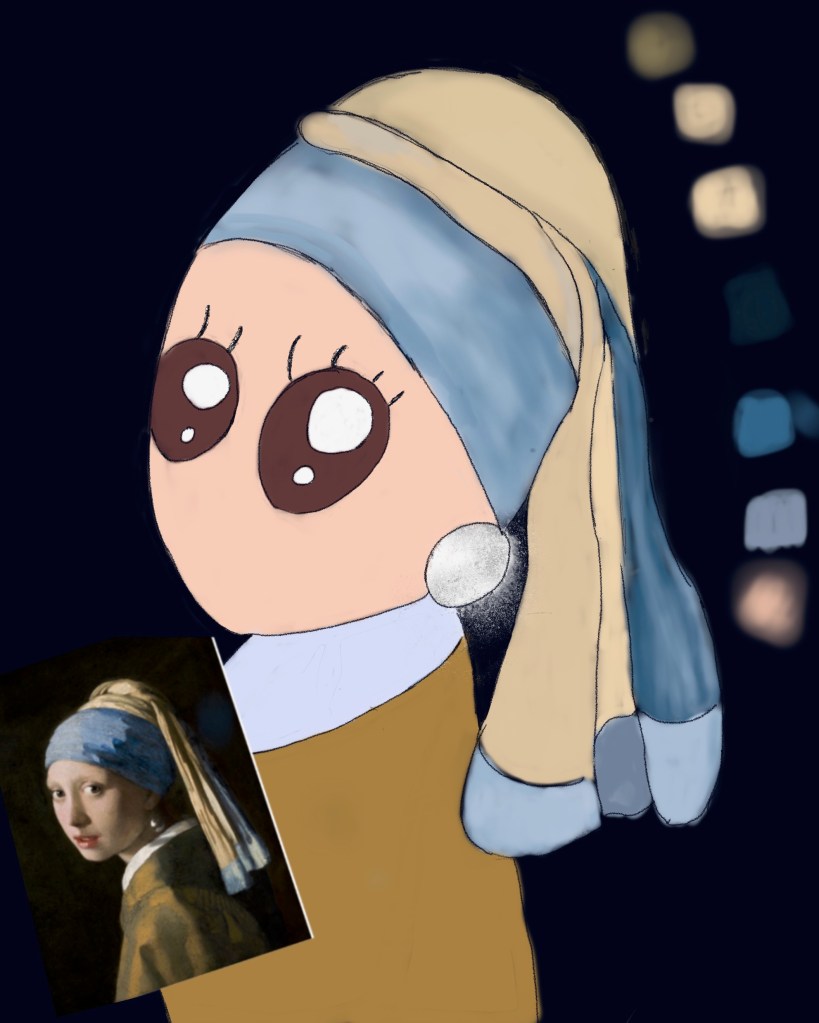
And now time for some painting! Here I went for my usual Medium Airbrush. In attempt to match the colors as closely as possible to the original Vermeer painting, I googled and downloaded a photo of it and by tapping on the colors, I was able to build a color palette from which I based my own piece with. Note a separate layer was assigned for each area and part of the subject. The background was then switched from plain white to pitch black, just like the orginal.
Fine Tuning
I did struggle a bit with getting the earring correct. I realized that due to the shadows, the pearl is not entirely white and hence I had to add some dark grey and then enhance, with the Lights Brushes, the area where the light hits. Also making it appear spheric was a challenge as my weakness lies in light and shade. I further tried some Gold Rush brushes to give the jewel a more pearly effect but with little success. Rather than give in, though, I decided to go for some variation again and introduce instead shimmer and glow without making it too bling. Enter Royal Textures Brush set by Schrill Art. And now we’re talking! The rest I decided to leave as is, although just for fun I did go over the eyelashes with Glitter Pen from the Gold Rush brushes. And now!

What fun that was! Although this painting is indeed inspired by another artist’s work, I adopted it to my style and am pleased with how it turned out. What made this session interesting is that I got to explore beyond my comfort zone again! Firstly, these are colors I never use but now I am amazed how beautifully they work. Also, I had the chance to discover effective ways in which to intensify the pearl earring. And now, I am keen on trying this out as a proper painting!
For more about my visit to the Vermeer Exhibition, please click here!

1 Comment